Profiling pro 9500 to Image Specialist inks

Emulator

Printer Master
Platinum Printer Member
Joined
Jan 4, 2012
Messages
1,675
Reaction score
1,308
Points
277
Location
UK
Printer Model
Canon Pro9000 II
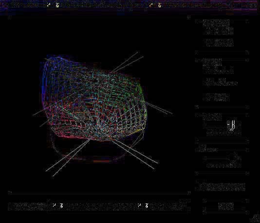
Attempting to illustrate just how much a profile is changed when "optimised" by the Lavender field image referenced above, these are the before and after WinColor profile projections.

9023_10-4-13satin.jpg
9023_15-7-13satin.jpg


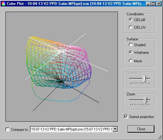
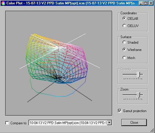
(The "Compare to" option does not illustrate the difference as well as two separate images of the two profile versions.)

The main differences are on the right hand side in the magenta and blue areas and the lower half down to the black point at the bottom.

It requires careful study to identify the differences. It does I think support the view that the ColorMunki Optimisation process is cumulative.
 

jtoolman

Printer Master
Platinum Printer Member
Joined
May 7, 2011
Messages
1,949
Reaction score
940
Points
277
Location
United States
Printer Model
All of them! LOL
I never claimed that it was not cumulative. Of course it is adding data and information to the original file.
It is an optimization after all. All I am saying is that by "SAVING AS" under a different name, you end up with TWO profiles!!!!!! The original "UN Optimized" one with contains the original data and the "Optimized" one which contains the original data PLUS the optimization ADDED to it!!!

The last thing I would want to happen is that after Optimizing a given CM profile, and saving it to itself, I end up with a single profile that may NOT be as "Good" as the original one.
I would NOT be able to undo that process. I would have to create another basic profile all over again.

In my windows COLOR folder I have two version of each profile. One is the original CM one and the second version is the slightly larger ( File Size ) optimized one.

Joe
 

Grandad35

Printer Master
Platinum Printer Member
Joined
Feb 24, 2005
Messages
1,669
Reaction score
182
Points
223
Location
North of Boston, USA
Printer Model
Canon i9900 (plus 5 spares)
One way to show the difference is to put the second image on top of the first as a separate layer in Photoshop, then set the blending mode for the top layer to "Difference", as shown below. If the two images aren't exactly centered on top of each other, shift the top layer until the horizontal and vertical axes disappear. Unfortunately, your two images were captured at a different rotation in at least 2 planes (note the rotated/shifted axes), so it is difficult to judge the difference in the gamut.

Since these plots only show the limits of the gamut, they would not be expected to show any difference made to tweaks in the LUT away from the outer limits.
113_9023_15-7-13_diff.jpg
 

Emulator

Printer Master
Platinum Printer Member
Joined
Jan 4, 2012
Messages
1,675
Reaction score
1,308
Points
277
Location
UK
Printer Model
Canon Pro9000 II
Grandad35

I agree with your comments, the "Compare to" on WinColor does a similar thing, but it is still very difficult to see the differences without careful examination, switching it on and off. See my post#20 regarding ColorThink 2, (for which I can't justify the cost) but from the demo, would allow a better assessment of the whole profile.


jtoolman

Yes I do the same by adding the date in the profile filename and may have several versions of each profile.

Regards

Ian
 

The Hat

Printer VIP
Platinum Printer Member
Joined
Jan 18, 2010
Messages
15,631
Reaction score
8,699
Points
453
Location
Residing in Wicklow Ireland
Printer Model
Canon/3D, CR-10, CR-10S, KP-3
I admire all you guys who take the time to profile all your papers for photos,
where as me well I just don't do that, time is limited.

Its just that I dont see a need for it because I am not into adjusting any of my photos, (The few that I print).

I take a picture and I print it as is, no adjustments, warts and all and dont try to include any angel dust or ribbons in them.

I print on cheap glossy paper with my i865 using the I.S. CLI-8 ink set and it looks perfectly good to me,
as just a snap shot forever frozen in time.

Whether its a B&W or colour it doesnt matter I find that the content of the photo (Subject)
is more interesting to me rather than how it was shot or which type of shading it was shot under, but thats just me.

I do like liking at all the wonderful photos that have been shot and shown on nifty but Im not into altering a photo once its been taken,
I dont think you should try to re-educate someones imagination, I reckon its to personal for interference.

I only use my printers manual colour adjustment when its needed for pacific graphic colours
which sometime can also include colour photos and if I cant get both of them adjusted properly together,
then I simply split my artwork in two and print in two passes on separate machines.

Because of the variety of different papers that I use its not feasible to profile for each one,
I have so many Canon printer that I can also cheat by using the many built in paper profiles
from any one of these printers to get the desired effect that I want.

Nearly all of my prints are on plain matte surfaces so colour can be adjusted
by the amount of ink lay down on one or more passes. (Overprinting)

Ill finish where I started, I really do appreciate the time and effort you guys put into your photographs and it does show your dedication to your art,
I did a scanner/printer profile once to get a good royal blue colour, so I do know how much work it takes..
 

Emulator

Printer Master
Platinum Printer Member
Joined
Jan 4, 2012
Messages
1,675
Reaction score
1,308
Points
277
Location
UK
Printer Model
Canon Pro9000 II
In a post on another subject, mention was made of PrintFab and RIP. I was not familiar with either term and curiosity tempted me to look them up.

For those in the same position see: http://www.printfab.com/en/ and http://en.wikipedia.org/wiki/Raster_image_processor

A raster image is also known as a bitmap. The last mention of a bitmap came up when we were discussing ColorMunki profile chart printing. So I thought it worth investigating.

I down loaded PrintFab. This is still in development and is thus free to download until the end of 2013.

There is a great deal to absorb and I have only scratched the surface so far. I have made one print of the Evaluation Image file, without any setting up, just to see what happened. It printed OK , but with some colour shifts, as might be expected.

An interesting thing is the control that PrintFab gives you over the printer, effectively bypassing parameters that the printer normally does not allow, other than indirectly through OEM printer paper selection profiles. During setup you enter the printer make and model and PrintFab makes use of this to set up its own printer related data.

One such parameter is deposited ink levels for each paper profile, which are tested and selected by the user. Normally you have to accept what the OEM paper profile offers.

Among other things yet to be explored, it occurred to me that this might have an impact on bronzing. It could be that some bronzing effects are due to an overload of pigment particles on microporous or nanoporous paper surfaces. If the ink volume for a particular troublesome colour is adjusted, bronzing might be reduced. For those with pigment printers this may be worth investigation.
 

jtoolman

Printer Master
Platinum Printer Member
Joined
May 7, 2011
Messages
1,949
Reaction score
940
Points
277
Location
United States
Printer Model
All of them! LOL
I just watched a webcast from a Ilford sponsored guy on youtube! Very informative for those looking to learn about general profile creation!

http://www.youtube.com/watch?v=n71OJIBac5E&list=PL2fVzV-M_S-0ZgpD3Fw6sSV8BOSZKEJR1

It basically clarified my question on what the CM software actually does when one optimizes an existing CM generated profile.
Assuming that the 100 patches total that the CM software generates is covering a sufficient range of separate colors, it is my thinking that the software basically is forced to interpolate between the relatively small number of colors ( though they may actually cover a wide range of color ) when compared to the much higher number of patches one can print and scan with the I-One for example.

So when you load a secondary image in the colormunki software, if it contains colors that were not found within the 100 that were originally used, will it "ADD" that new data to the optimized profile?

If that is yes, you could also load say a 20 or so Black to White step wedge, and the system will look at those grays and generate a third set of patches representing the range of grayscale values that were in the step wedge but not found in the original 100 colors.
This "NEW" data is supposedly added to the original profile. Does it allow to print a more linearly neutral B&W? According to the video, it does.

So what if I load a tiff with hundreds of color patches such as those meant to be used with a highend profiler? Theoretically this type of image would contain many other colors which would have not been DIRECTLY present within the 100 patches on the two basic test prints that the CM software generates.

Would more data, from those colors be added to the existing profile being optimized? Is it actually and improvement? If were visualize the two profiles on a profile viewer, would the optimized one show a larger volume when compared directly to the un-optimized one? Or is this a total waste of time? I would tend to think that it is not. Why would they include the Optimization Option to their software if it was a waste of time.

If optimization is an additive process, which adds more and more color info, then is there a limit? Can a profile be optimized several times with different images containing all sorts of colors which are not part of the original 100? Or does the 100 colors, when properly interpolated encompass the a sufficiently large gamut?

I know that I compared a RR Aurora White profile from RR and the one I made and optimized and the most graphic difference was in the ability to be able to print deeper blacks. If you view the video I linked above, I came up with basically similar improvement in my own optimized profile. Color gamut was about the same, with the only improvement being that mine had more information on the bottom of the profile when viewed in 3D.

In an actual print, the visual difference is hard to see unless you view two prints side by side under very strong lighting. One has slightly more tonal separation in the very darkest regions where the other sort of blends together as a single dark not as defined dark shade.
Again, you have to the two together.

So I would love to hear more discussion from those you who unlike me, are profiling experts.
I have very basic knowledge but I am not a color engineer so much of what I know is only from what I've read, added to plenty of speculation and assumptions.

Thanks in advance!

Joe
 

Emulator

Printer Master
Platinum Printer Member
Joined
Jan 4, 2012
Messages
1,675
Reaction score
1,308
Points
277
Location
UK
Printer Model
Canon Pro9000 II
Joe, I think we should start a new topic related to developing printer profiles.

Watched the hour long educational youtube in your link.

These are also informative http://www.google.co.uk/search?q=Co...x&ie=&oe=&gws_rd=cr&ei=3JcTUqaAN-TY0QXyhoGwAQ
Try googling ColorThink on youtube.

The profile mesh may suffer from an uneven distribution of spot points within the mesh or fail to extend out to the gamut limits or several other deficiencies.

There is a limit to profile file size, I've seen it quoted somewhere but can't find it now. But within that, I believe ColorMunki Optimisation will continue to either fill in points or extend the coverage, with each iteration.
 

jtoolman

Printer Master
Platinum Printer Member
Joined
May 7, 2011
Messages
1,949
Reaction score
940
Points
277
Location
United States
Printer Model
All of them! LOL
I will copy and paste it as a new topic. I think it deserves a bit of discussion since the "Weakness" of the Colormunki system has always been said to be the limited number of colors that it uses to create a profile when compared to the I-One and other "BIG" boys!

Joe
 
Top