Vivid Magenta K3 inks on a Non VM printer

jtoolman

Printer Master
Platinum Printer Member
Joined
May 7, 2011
Messages
1,949
Reaction score
940
Points
277
Location
United States
Printer Model
All of them! LOL
Ok I prepared a set of carts using OEM K3 with VM for my R2400.
I printed a selected file on my R2880 as a control using EPSON Premium luster and the canned EPSON profile.
Matched my screen

I then printed the same file on the R2400 using OEM Normal magenta K3 on EPSON Premium luster using EPSON profile.
Matched my screen

I switched the regular magenta for Vivid Magenta filled carts on the R2400 - Ran three cleanings to purge out as much of the original magenta.

Printed one each of the same file, same paper, with EPSON R2400 ICC and R2880 ICC

The one with EPSON R2400 ICC printed with much more saturated reds, oranges and purples were more magenta.
The one with EPSON R2880 ICC printed not much more different. Reds, oranges and purples were more magenta.

Both prints printed as if they were too saturated. Areas that were supposed to be neutral white had a slight bluish tint. Weird!

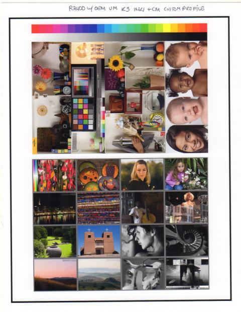
So I then made a custom profile of for the R2400 with the K3 Vivid Magenta inks / Epson Premium Luster.

The print pretty much matched the one made by the R2880. The R2400 seemed a tiny bit more magenta. I has a slight bias toward magenta in some of the deep blue areas. I attribute that to my profile. Either print would be considered excellent.

Here are the scans of a standard image file and some of my personal images:

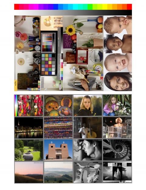
Original Image file:

8056_matrix_pdi_2_pix.jpg


Print from the above file on R2400 with OEM K3 VM inks EPSON PREMIUM LUSTER and Colormunki Profile.

8056_epson_luster_ocp_cm_profile004.jpg


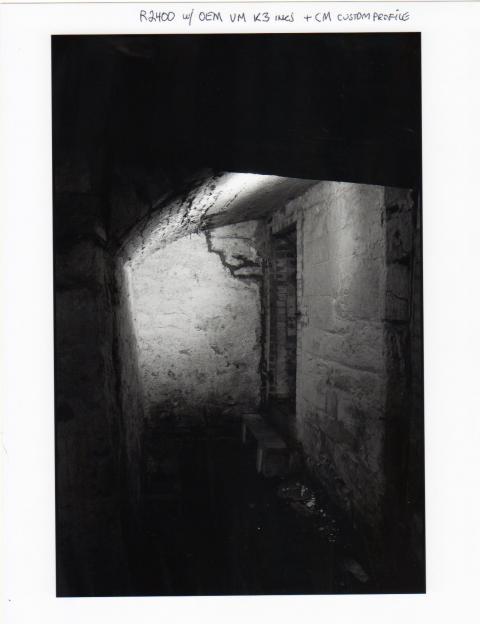
The next two images are scans of actual B&W and a collage of a file both in color and B&W

The B&Ws are visually perfectly neutral.

8056_epson_luster_ocp_cm_profile002.jpg


8056_epson_luster_ocp_cm_profile001.jpg


So from what I can see with my eyes, I was able to produce good results. But only after profiling.

So will I be able to use my abundance of Vivid Magenta inks? It does look like I can.

Joe
 

mikling

Printer VIP
Platinum Printer Member
Joined
Jul 2, 2006
Messages
3,239
Reaction score
1,471
Points
313
Location
Toronto, Canada
Quite often the question of can it be used to "improve" the output of the 2400 is raised. That is the direction I was seeing. That it could be used with an custom ICC was not in question.

Joe, if you can you should make a print on the 2400 using OEM Magentas and not VM using your CM as well. This will remove the variance of the CM error and make the two equal. At that point any errors due to your profile will be matched out evenly. The comparison between the two would be more valid.

The other detail in your test that I don't see is the rendering intent used. I think this is important you'll see why.

I have thought about these things for at least a couple of years and there is actually not a lot of in depth knowledge posted on the internet of the mechanics of what goes on. We see do this and do that but there is never any explanation of what is happening. I am not trained in these things but have given it some thought and here are my guesses of what is sometimes overlooked.

Suppose there was a color that could be printed accurately. Does choosing a rendering intent when printing it shift that color? on absolute..I guess it should not. On perceptual and relative colorimetric I say yes. The compression schemes both shift colors a bit, on relative colorimetric it depends on where the color is.

Now stay with me here. How much does it shift? That is the interesting thing. Depends on the color and what else?

Now give this some further thought. Suppose you had a really lopsided shape on the profile and had another smoothly shaped one but the smooth shaped one had a smaller volume. The general spec thrown around is gamut volume. Now which one would print better? I don't know. My gut tells me that it depends on the image, but in general the smooth nicely shaped one is possibly better. What happens when you choose a rendering intent on the odd shaped profile? and the smooth shaped one.

Now the next question is this. Why do mfrs dream up all sorts of different shades to use in their printers. I can confidently state that lately the OEM colors are getting harder to match and that is not surprising. How do they arrive at a chosen color to use? Is there such a thing as an "ideal" magenta or cyan etc. Why not?

Again I don't know the answers but I have more questions than answers.

What I do know is that a lot of time is spent on supercomputers to simulate colors and screening patterns to optimize printers. How they do it is beyond me.

What we should look at is a huge sampled profile of the 2400 using VM and non VM and compare the same to the 2880 using VM...all OEM.
 

jtoolman

Printer Master
Platinum Printer Member
Joined
May 7, 2011
Messages
1,949
Reaction score
940
Points
277
Location
United States
Printer Model
All of them! LOL
mikling said:
Quite often the question of can it be used to "improve" the output of the 2400 is raised. That is the direction I was seeing. That it could be used with an custom ICC was not in question.

Joe, if you can you should make a print on the 2400 using OEM Magentas and not VM using your CM as well. This will remove the variance of the CM error and make the two equal. At that point any errors due to your profile will be matched out evenly. The comparison between the two would be more valid.

I would need to reinstall the regular magentas. But yes, I agree that would need to create a profile with the colormunki to test against the VM colormunki profile.

The other detail in your test that I don't see is the rendering intent used. I think this is important you'll see why.

Yes. I did print them using Perceptual. Any suggestions?

I have thought about these things for at least a couple of years and there is actually not a lot of in depth knowledge posted on the internet of the mechanics of what goes on. We see do this and do that but there is never any explanation of what is happening. I am not trained in these things but have given it some thought and here are my guesses of what is sometimes overlooked.

Suppose there was a color that could be printed accurately. Does choosing a rendering intent when printing it shift that color? on absolute..I guess it should not. On perceptual and relative colorimetric I say yes. The compression schemes both shift colors a bit, on relative colorimetric it depends on where the color is.

Now stay with me here. How much does it shift? That is the interesting thing. Depends on the color and what else?

Now give this some further thought. Suppose you had a really lopsided shape on the profile and had another smoothly shaped one but the smooth shaped one had a smaller volume. The general spec thrown around is gamut volume. Now which one would print better? I don't know. My gut tells me that it depends on the image, but in general the smooth nicely shaped one is possibly better. What happens when you choose a rendering intent on the odd shaped profile? and the smooth shaped one.

Now the next question is this. Why do mfrs dream up all sorts of different shades to use in their printers. I can confidently state that lately the OEM colors are getting harder to match and that is not surprising. How do they arrive at a chosen color to use? Is there such a thing as an "ideal" magenta or cyan etc. Why not?

Again I don't know the answers but I have more questions than answers.

What I do know is that a lot of time is spent on supercomputers to simulate colors and screening patterns to optimize printers. How they do it is beyond me.

What we should look at is a huge sampled profile of the 2400 using VM and non VM and compare the same to the 2880 using VM...all OEM.
 

jtoolman

Printer Master
Platinum Printer Member
Joined
May 7, 2011
Messages
1,949
Reaction score
940
Points
277
Location
United States
Printer Model
All of them! LOL
OK I just made a Profile for the R2400 K3 with regular magenta and then printed the same test image. Both the prints, with VM and with regular Magents were printed with Perceptual intent.

Here is a Direct Conparison Between the Regular Magenta ( Left - SOLID ) and Vivid Magenta ( Right - WIREFRAME ). Both on the R2400 - EPSON Premium Luster

8056_vivid_vs_regular_mafg_on_r2400.jpg


Mike, what further work would I need to do?

Joe
 

mikling

Printer VIP
Platinum Printer Member
Joined
Jul 2, 2006
Messages
3,239
Reaction score
1,471
Points
313
Location
Toronto, Canada
This is very interesting Joe, take a close look at the magenta cast in the blues you mentioned before and see if it is still there.

Also take a close look at the Gretag Macbeth color patch in the photo and see how radiant the blue is. Compare those areas between the VM and M. Which blue is better.
You might want to see if the rendering intent is causing this...i.e turn it off and reprint...........see, profiling tools and curiosity costs a lot of paper and ink.
 

mikling

Printer VIP
Platinum Printer Member
Joined
Jul 2, 2006
Messages
3,239
Reaction score
1,471
Points
313
Location
Toronto, Canada
About the bluish tint......in the neutral areas. I believe the boys at Luminous Landscape know why this is so...they know their stuff there. You might want to wander over there if you haven't before
 

jtoolman

Printer Master
Platinum Printer Member
Joined
May 7, 2011
Messages
1,949
Reaction score
940
Points
277
Location
United States
Printer Model
All of them! LOL
I would have to reprint that file and switch inks again. I am now running on Regular Magenta.

I decided to simply compare between PROFILES VM and Reg Mag using a standard image.
and the results are quite simmilar. The bigger colors shifts on prints were visible when I compared my R2400 VM profile to EPSON's R2880

Now I have R2400 Vivid and Non Vivid profiles which makes more sense as far as comparing the differences when using the R2400 only.

This is the only image I am using for these tests.

8056_matrix_pdi_2_pix.jpg


If you look at the upper row of color patches, the reds on the right and left actually printd with a bit more separation in the prints with VM than the other.
BUT...... the gree patches are a smidgen better separated in the regular magenta print.

Prints with the VM are gorgeous. But then so are the ones with Regular magenta. So I am thinking that the 9% increase in gamut ( According to the gamut map ) is not really that
significant visually speaking.
 

jtoolman

Printer Master
Platinum Printer Member
Joined
May 7, 2011
Messages
1,949
Reaction score
940
Points
277
Location
United States
Printer Model
All of them! LOL
mikling said:
About the bluish tint......in the neutral areas. I believe the boys at Luminous Landscape know why this is so...they know their stuff there. You might want to wander over there if you haven't before
That was because I was printing with VM using an EPSON regular magenta R2400 profile.
Profiling with the CM removed that!
Is almost looked solarized!

Joe
 

jtoolman

Printer Master
Platinum Printer Member
Joined
May 7, 2011
Messages
1,949
Reaction score
940
Points
277
Location
United States
Printer Model
All of them! LOL
mikling said:
This is very interesting Joe, take a close look at the magenta cast in the blues you mentioned before and see if it is still there.

Also take a close look at the Gretag Macbeth color patch in the photo and see how radiant the blue is. Compare those areas between the VM and M. Which blue is better.
You might want to see if the rendering intent is causing this...i.e turn it off and reprint...........see, profiling tools and curiosity costs a lot of paper and ink.
The difference between the two Profiles ( R2400 printer only ) is visually minimal. The Blues on the Card look almost the same to me. I could just send you some prints if you would like me to.
I used Percetual intent which probably shifted quite a few values that would have been out of gamut into gamut.
Should I print the same file but using Relative Colorimetric which should not shift the already in gamut colors? I would have to do a magenta swop again though.

I am no expert when it comes to Rendering intents. I seem to always chose percetual since I do lots of scenery and landscapes. For protraits and anything with skin tones I get better and truer results with R C.
 

mikling

Printer VIP
Platinum Printer Member
Joined
Jul 2, 2006
Messages
3,239
Reaction score
1,471
Points
313
Location
Toronto, Canada
jtoolman said:
mikling said:
This is very interesting Joe, take a close look at the magenta cast in the blues you mentioned before and see if it is still there.

Also take a close look at the Gretag Macbeth color patch in the photo and see how radiant the blue is. Compare those areas between the VM and M. Which blue is better.
You might want to see if the rendering intent is causing this...i.e turn it off and reprint...........see, profiling tools and curiosity costs a lot of paper and ink.
The difference between the two Profiles ( R2400 printer only ) is visually minimal. The Blues on the Card look almost the same to me. I could just send you some prints if you would like me to.
I used Percetual intent which probably shifted quite a few values that would have been out of gamut into gamut.
Should I print the same file but using Relative Colorimetric which should not shift the already in gamut colors? I would have to do a magenta swop again though.

I am no expert when it comes to Rendering intents. I seem to always chose percetual since I do lots of scenery and landscapes. For protraits and anything with skin tones I get better and truer results with R C.
Yes, I run into the same at times. RC turns out better many times for fleshtones because we can pick up the differences in that area quickly and in gamut colors hold better. Think of smartstretch on wide screen tvs. RC does something like that. The non smart stretch TV is like perceptual. Everything gets distorted and I believe the stretching will vary depending on the shape of the profile. That's what I think anyways. I suspect if you know your printer well ( but you have so many) you'd know that judging by the image content, you'd want to choose the correct rendering. Do you softproof?

So the conclusion is? Should someone try using VM on a non VM in the hopes to improve performance over stock? That question has always been asked for years.
 
Top