Profile Results

barfl2

Print Addict
Joined
Feb 22, 2010
Messages
481
Reaction score
65
Points
168
Location
Hampshire U.K.
5268_img.jpg
like mrelmo I am getting there. I have examples from Digital Dog,Colour Collective/Colour Confidence/Northlight Images.

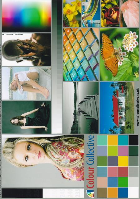
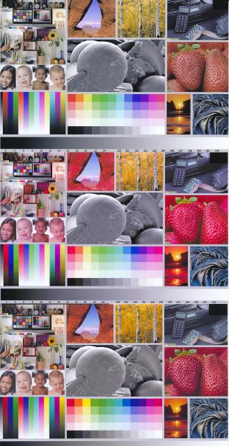
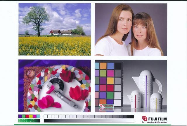
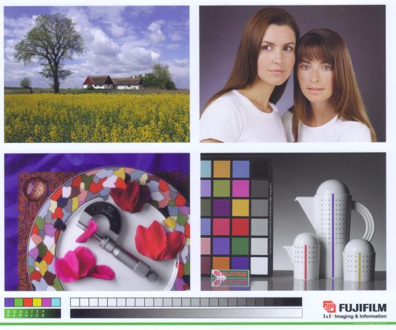
I found it useful to print 6x4's say of the digital dog using a variety of paper selections covering my paper stock canon/HP?Stihl only using the printer drivers not Photoshot Elements 10. I am getting very good results very close to my Monitors with I have set as well as possible with the Quick Gamma Utility set at 2.2 gamma
 

mrelmo

Print Addict
Joined
Apr 1, 2007
Messages
427
Reaction score
36
Points
161
Location
Buffalo, New York
ok making progress, the profile i downloaded was a rar file that needed to be unzipped which i did not do, checking over my settings in elements i have photoshop manages, the profile i am using is adobe rgb 1998, rendering perceptual, and here is the latest scan the newest is the bottom which i added to the previous scanned image, i think it is a big improvement

2123_proof_4.jpg
 

Emulator

Printer Master
Platinum Printer Member
Joined
Jan 4, 2012
Messages
1,675
Reaction score
1,308
Points
277
Location
UK
Printer Model
Canon Pro9000 II
Yes, that looks much better. The Hats comment about making sure you have stopped the printer managing colours is important. For the Canon 9000 II, in Elements you click PRINT, then CHANGE SETTINGS, then ADVANCED SETTINGS, then make sure the COLOR/INTENSITY MANUAL ADJUSTMENT box is ticked, then click the MAIN tab, then make sure the MANUAL dot is selected and click SET, then click the MATCHING tab and make sure NONE is selected.
 

mikling

Printer VIP
Platinum Printer Member
Joined
Jul 2, 2006
Messages
3,239
Reaction score
1,471
Points
313
Location
Toronto, Canada
The reds are still too strong because the original image is ProPhoto and you are using Adobe RGB which is going to boost it. Reverse back to a sRGB test image as I linked to and then try again. The photo you are using should really only be used with calibrated monitors so the Prophoto space will have a chance to come up properly depending on the monitors' capability.
 

mrelmo

Print Addict
Joined
Apr 1, 2007
Messages
427
Reaction score
36
Points
161
Location
Buffalo, New York
the newest print, my monitor compared to the picure is a litle red that i can see in the flesh tones but the print looks good


2123_proof_2_girls.jpg
 

jtoolman

Printer Master
Platinum Printer Member
Joined
May 7, 2011
Messages
1,949
Reaction score
940
Points
277
Location
United States
Printer Model
All of them! LOL
Too much blue/magenta.
 

The Hat

Printer VIP
Platinum Printer Member
Joined
Jan 18, 2010
Messages
15,618
Reaction score
8,691
Points
453
Location
Residing in Wicklow Ireland
Printer Model
Canon/3D, CR-10, CR-10S, KP-3

crenedecotret

Print Addict
Joined
Oct 5, 2006
Messages
161
Reaction score
52
Points
163
mrelmo.. some will really disagree here but you're close enough that I would say you properly used the profile in your software which was not the case in your original post. I've used one of mike's profiles in the past and it was quite good so I would trust that your print is now OK if you were using the same printer/ink/paper combination. If any of these change, printer ink or paper, the profile is invalid.

Now it's very possible that the scanner you're using to show us the print is introducing it's own set of color issues. Add that to the fact that some of us could be viewing this image on a non-calibrated monitor in a non-color-managed browser.... There is a very good chance that not all of us are seeing the exact same colors on our monitors.

I don't think we can judge the result of a printer profile if the rest of the chain (monitor, scanner) isnt properly profiled.

If you are looking to a good monitor to print match, you really need to profile your monitor. 6500K, Gamma 2.2, 110-120 cdm is a good frequently recommended start, but with the light I use to view the prints I get a better match with 5100K Gamma 2.2, 110cdm. 5100K is closer to my monitor's native white point, and matches paper and room lighting a bit better.

If you don't have access to a way to calibrate your monitor, view your print under good lighting the adjust the brightness, contrast and RGB channels on your monitor to match the print. To view my prints, I use a desktop ott-lite I bought from costco a few years ago, nothing professional but perfect for the task. My monitor used to be calibrated with a Spyder2, now using a Colormunki. Both work fine. Used Spyder2s go for pretty cheap these days and it's a good investment. I got a bit more "range" between highlights and shadows with the munki.
 

crenedecotret

Print Addict
Joined
Oct 5, 2006
Messages
161
Reaction score
52
Points
163
I figured just for the heck of it, I would print out the image with a profile (IP4500, Hobbicolors and Kodak cheap glossy paper). I scanned it back in, applied my scanner profile and converted to sRGB. Now it does NOT match the original image exactly, it does however MATCH the SOFT PROOF of the original image using the printer profile which is what we want to see with color management.

Here is the result
1626_srgb_fuji_test.jpg
 

Emulator

Printer Master
Platinum Printer Member
Joined
Jan 4, 2012
Messages
1,675
Reaction score
1,308
Points
277
Location
UK
Printer Model
Canon Pro9000 II
Interesting, comparing the two on my calibrated monitor, I would say the noticeable difference is that mrelmo's image has a little higher colour saturation than crenedecotret's.
 
Top