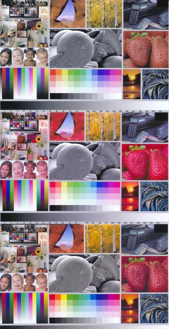
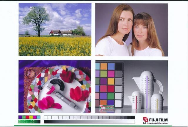
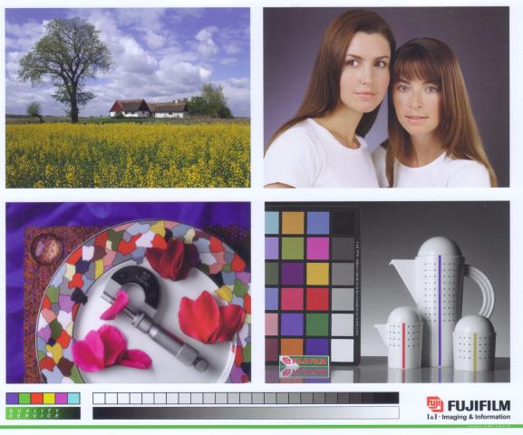
mrelmo.. some will really disagree here but you're close enough that I would say you properly used the profile in your software which was not the case in your original post. I've used one of mike's profiles in the past and it was quite good so I would trust that your print is now OK if you were using the same printer/ink/paper combination. If any of these change, printer ink or paper, the profile is invalid.
Now it's very possible that the scanner you're using to show us the print is introducing it's own set of color issues. Add that to the fact that some of us could be viewing this image on a non-calibrated monitor in a non-color-managed browser.... There is a very good chance that not all of us are seeing the exact same colors on our monitors.
I don't think we can judge the result of a printer profile if the rest of the chain (monitor, scanner) isnt properly profiled.
If you are looking to a good monitor to print match, you really need to profile your monitor. 6500K, Gamma 2.2, 110-120 cdm is a good frequently recommended start, but with the light I use to view the prints I get a better match with 5100K Gamma 2.2, 110cdm. 5100K is closer to my monitor's native white point, and matches paper and room lighting a bit better.
If you don't have access to a way to calibrate your monitor, view your print under good lighting the adjust the brightness, contrast and RGB channels on your monitor to match the print. To view my prints, I use a desktop ott-lite I bought from costco a few years ago, nothing professional but perfect for the task. My monitor used to be calibrated with a Spyder2, now using a Colormunki. Both work fine. Used Spyder2s go for pretty cheap these days and it's a good investment. I got a bit more "range" between highlights and shadows with the munki.