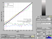
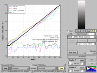
Profile Assessment

Emulator

Printer Master
Platinum Printer Member
Joined
Jan 4, 2012
Messages
1,675
Reaction score
1,308
Points
277
Location
UK
Printer Model
Canon Pro9000 II
Then I am obviously thinking on the right lines! :)

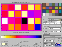
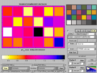
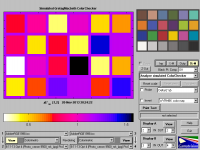
Here are the ColorChecker charts for all the stages of optimisation, with Black Point Compensation turned off, as you said, the Delta Eab values are reduced without BPC.
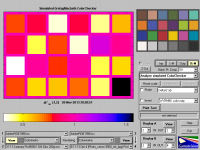
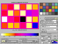
Primary.pngOpt 1.pngOpt 2.png
Opt 3.pngOpt 4.png

I notice that stepping across between the five images in the enlarged mode, is unpredictable, you need to check what is written in the lower lefthand box on the image.

The Eab values are increased slightly then reduced slightly across the range. This applies to the colours in the target, there is no knowing what is happening elsewhere.

With regard to the black and white density response settings, which option is the most useful?
 
Last edited:

RogerB

Print Addict
Joined
Sep 27, 2010
Messages
293
Reaction score
315
Points
183
Location
S.E. England
Printer Model
Epson Pro3880
Looking at your Delta E values I would say that the optimisation is changing the profile slightly but not necessarily improving it. However, with Delta E figures as low as you have there is not much room for improvement. Bear in mind that a Delta E of 1.0 is the smallest error observable by the average viewer, even for colour patches placed side by side. For two real prints, one in each hand, people have trouble detecting much larger errors so I think the law of diminishing returns is applicable here.

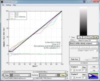
The greyscale response may tell you a bit more. The view that I use is shown in these screenshots. The a* b* errors in the worse one give noticeable colour banding in B&W prints and the non-linearity in the overall response can sometimes be visible as density banding. The better one is very good - no banding of any kind.

Grey_bad.jpg Grey_good.jpg

I should say that the better one here is for a printer with three black inks. This level of neutrality would be hard to achieve with a single black.
 

Emulator

Printer Master
Platinum Printer Member
Joined
Jan 4, 2012
Messages
1,675
Reaction score
1,308
Points
277
Location
UK
Printer Model
Canon Pro9000 II
I am still learning the interpretation of these GamutVision displays.

Am I right when I suggest that the "a,b & c" dotted lines show the Canon 9000 is using all its dye inks over the full range to create black & white images. However the 3800 pigment colour inks are only used in the deep black region and then only the black and Lt black/grey inks are used for the rest of the scale to white?

It is interesting to switch Black Point Compensation on and off, to see what it actually does round about Dmax.
 

RogerB

Print Addict
Joined
Sep 27, 2010
Messages
293
Reaction score
315
Points
183
Location
S.E. England
Printer Model
Epson Pro3880
The a* and b* values are the deviations (in the L*a*b* colour space) from pure grey in the green-red and blue-yellow axes respectively. The c* value is the absolute colour content (error) in the "grey" output. Abrupt changes in c* will generally result in colour bands in neutral gradients.

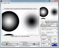
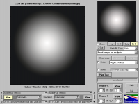
The Canon 9000 will use colour inks to produce grey over most of the tonal range. The black is only used for the densest tones. It is difficult to get a perfect balance of CMY inks to make grey but a good profile should get the c* values below 1.0. This is acceptable to most people as long as there are no sharp changes, as there are in the example I have given. That example will give a very obvious (and objectionable) yellowish band at an input L* between 45 and 52 - right in the middle of the tonal range. You can simulate it in Gamutvision like this. (The circular gradient has to be in an RGB colour space for Gamutvision to read it.)

GreyGrad.jpg

Any printer with multiple black inks (i.e. grey inks) will use predominantly those inks to print greyscales, although there is still some colour needed to maintain perfect neutrality. Black pigment inks tend to be a bit warm.

It's worth getting familiar with the Gamuvision tools; can save you a lot of paper, not to mention frustration.
 

Emulator

Printer Master
Platinum Printer Member
Joined
Jan 4, 2012
Messages
1,675
Reaction score
1,308
Points
277
Location
UK
Printer Model
Canon Pro9000 II
Thanks Roger, that calls for some thinking and experimentation.

( P.S. I have edited this post to add the three intermediate optimisation profile B & W density responses. This now gives a more complete picture of this aspect of the optimisation process.)

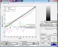
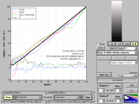
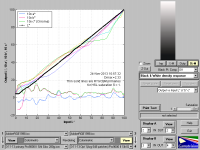
The B & W density responses for the primary, first, second, third and fourth optimisation profiles are below.

B & W Density Primary Profile.png B & W Density Opt 1 Profile.png B & W Density Opt 2 Profile.png
B & W Density Opt 3 Profile.png B & W Density Opt 4 Profile.png

One might say that the primary profile is better than the fourth optimisation. However when I looked at an image print, I don't think that was the case, I will have to study some prints again. This is the subjective versus the objective!!

I tend to favour the objective normally.
 
Last edited:

RogerB

Print Addict
Joined
Sep 27, 2010
Messages
293
Reaction score
315
Points
183
Location
S.E. England
Printer Model
Epson Pro3880
T However when I looked at an image print, I don't think that was the case, I will have to study some prints again. This is the subjective versus the objective!!

I tend to favour the objective normally.

The objective is certainly my first port of call, but the final arbiter must be the print.

Looking at your simulations I would say that the original greyscale response is better. The fourth optimisation shows bigger chroma errors and the linearity is worse. Look at the deviations between 50 and 60. Will there be a difference in prints? Hard to say. Almost certainly not obvious in an average scene, but maybe in some B&W images with subtle gradients, like areas of clear sky. Try printing a circular gradient that goes from pure black to pure white - that is a pretty tough one for any printer!
 

Emulator

Printer Master
Platinum Printer Member
Joined
Jan 4, 2012
Messages
1,675
Reaction score
1,308
Points
277
Location
UK
Printer Model
Canon Pro9000 II
I have edited post #45 to include all 5 B&W density response charts to give a more complete picture of the optimisation process.
 

RogerB

Print Addict
Joined
Sep 27, 2010
Messages
293
Reaction score
315
Points
183
Location
S.E. England
Printer Model
Epson Pro3880
I have edited post #45 to include all 5 B&W density response charts to give a more complete picture of the optimisation process.
Just looking at these plots it looks as if the original is the best! (At least for B&W) Have you tried to compare prints of a circular B&W gradient?
 

mikling

Printer VIP
Platinum Printer Member
Joined
Jul 2, 2006
Messages
3,239
Reaction score
1,471
Points
313
Location
Toronto, Canada
I would expect the Pro9000 to have some levels of struggles in printing a circular B&W gradient, many others have noted that the 9000 has issues with B&W and that was its weakness. One trick that can be attempted in Argyll CMS is to use 512 samples in greyscale as part of the target in addition to other normal samples. This has helped with 6 color printers that I have been profiling. It does not eliminate the issue but it helps dampen it down a bit. Remember that these printers did not start out life as a B&W printer. Also consider the media setting used in your color targets. I have had to experiment with this and believe it or not it matters. If that is so, you will need to go back to square one and start all over again and see if there is any improvement with media settings. With real pro printers, you can play with density settings etc. in the driver. Not with the 9000 where the only chance to do so is with the choice of media.

One thing that might be considered is each time you make a reading, you will get a different reading, that's simply a fact with all devices. If you are doing this with the Colormunki, I suspect that you are taking readings that incorporates data from previous readings in the optimization process. This in itself might be a factor in your struggles and one reason why the original appears to be better.
Why? because spectrophotometer sensors need warm up time and there is also drift involved. When you take readings gathered from different times, it is possible that the readings themselves are part of the error. If you had taken all readings each time in one batch then there might be better relative consistency between the readings which is critical in B&W. This might or might not be a shortcoming of the color munki process or strategy. In non critical situations the different read times of the sensor might not be a big factor but when you come to trying to linearize B&W, that could be an issue. I don't know.

The other aspect is the color munki device itself. Its' design allows stray light to affect the readings taken as opposed to the more expensive models from Xrite where this aspect is recognized and a different design is used. I suspect intuitively that the stray light may have more influence in B&W data readings.
 

Emulator

Printer Master
Platinum Printer Member
Joined
Jan 4, 2012
Messages
1,675
Reaction score
1,308
Points
277
Location
UK
Printer Model
Canon Pro9000 II
RogerB,

Thank you for all your input.

I have used PSE8 to create B to W and W to B 360 degree radial gradient images. As you said, I started in greyscale, but had to convert the images to sRGB for GamutVision to be able to read them.

I have used the Black to White gradient image to evaluate each of the CM profiles, from the primary profile through to the fourth optimisation.

CM Primary B to W 360 deg. radial gradient.png CM Opt 1 B to W 360 deg rad grad.png CM Opt 2 B to W 360 deg rad grad.png
CM Opt 3 BtoW 360 deg rad grad.png CM Opt 4 BtoW 360 dec rad grad.png
(Incidentally, when viewing the individual images in enlarged format, ignore the title above the image, it represents a folder name not a file name. Look at the lowest boxes for the profile identification.)

The primary looks pretty good to me and the rest go down hill slightly, but may not be noticeable in a typical image. So the old Pro9000 II on IS inks is not so bad and this is just on the B&W side, I have yet to evaluate the colour quality of the five profiles. Any recommendations on the method?
 
Last edited:
Top