When you google for 'print quality' you get millions of links, which could already be an indication of the complexity, and there is a publication which describes in some detail the difficulties and the complexity to define a measure for 'print quality' - the idea what it encompasses varies widely between users, and this article does not make it simpler and easier.
https://www.researchgate.net/public...y_metrics_for_the_evaluation_of_print_quality
I couldn't stop and had another look to the differences between an ET-8550 and an L1800 - this printer with light inks. I'm using the approach from above - scan 2 light cyan color zones of patch sheets printed with these printers and display the data as a pixel cloud in a color space, I'm using this time the ColorInspector 3D which does not let me overlap several images but can display the data in various different color spaces, MonacoGamutWorks only in the Lab space.
https://home2.htw-berlin.de/~barthel/ImageJ/ColorInspector/help.htm
https://imagej.nih.gov/ij/plugins/color-inspector.html
'To run it, download
ColorInspector3D.jar and double click on it. On Windows, Java 5.0 or later must be installed.'
It's an old program but free, a similar display would be possible with the Colorthink software by Chromix - but at a charge.
These are crops of the color spots - this from the L1800

and this from the ET-8550

The noise pixel clouds look like these - in the Lab color space, this for the L1800
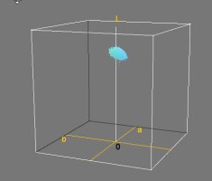
and this for the ET-8550

It is directly visible that the ET-8550 pixels have a wider variance in vertical direction - indicating a wider spread
of luminance values , and the eye is more sensitive to these than to chroma variations, this makes such variations more visible to the viewer. The color spots for the display of the stray colors and luminance are 7,5 x 8 mm, the spots shown above are cropped to about 2,5mm, the 2400 dpi at scanning works like a strong magnifier, the images are about 240 pixels wide - 1 tenth of an inch = 2,5mm.




