Underwhelmed By Pro-100

PeterBJ

Printer VIP
Platinum Printer Member
Joined
Nov 27, 2010
Messages
5,064
Reaction score
4,914
Points
373
Location
Copenhagen Denmark
Printer Model
Canon MP990
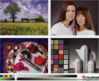
I do not have Photoshop, but I have the free-ware Irfan View, that can do RGB colour samples, using a Windows Paint plug-in, so I sampled the fifth grey field from the left in the small grey scale. These are the values for Pro 9000: R/G/B = 95/128/107, and for the Pro 100: R/G/B = 82/77/73. This proves the existence of colour casts. By copying the images and inserting in a program I bypass the colour deficiencies of my monitor.

This little window shows the difference between the two sampled grey fields that both should have been the same neutral grey.

colour samples.jpg


The foreground colour is from the Pro 100 and the background colour is from the Pro 9000.
Edit: sampling the same grey field in my downloaded test image gives the values R/G/B = 102/102/102
 
Last edited:

mikling

Printer VIP
Platinum Printer Member
Joined
Jul 2, 2006
Messages
3,239
Reaction score
1,471
Points
313
Location
Toronto, Canada
Roy is correct, I am also seeing a green cast.

The original image used has a ProPhoto colorspace. Unless, he has profiled his monitor, the color of the images shown will be incorrect. Also questions need to be asked as to what software he is using to print these images as well. The images printed show that the color space conversion done by the software are incorrect so there is also a set up and printer settings issue.

Somebody' is going to have a headache thinking this through.

The user should step back into sRGB images to start off first and then proceed from there.
 

PeterBJ

Printer VIP
Platinum Printer Member
Joined
Nov 27, 2010
Messages
5,064
Reaction score
4,914
Points
373
Location
Copenhagen Denmark
Printer Model
Canon MP990
Roy is correct, I am also seeing a green cast.

The original image used has a ProPhoto colorspace. Unless, he has profiled his monitor, the color of the images shown will be incorrect. Also questions need to be asked as to what software he is using to print these images as well. The images printed show that the color space conversion done by the software are incorrect so there is also a set up and printer settings issue.

Somebody' is going to have a headache thinking this through.

The user should step back into sRGB images to start off first and then proceed from there.

The original test image works fine for me with windows XP, Vista and 7 all 32 bit, but not with Windows 8 and 8.1 64 bit, see this: http://www.printerknowledge.com/thr...5200-and-other-printers-under-w8-64-bit.8115/ . A file conversion to sRGB solved the problem, so I can now use the test image again.
 

opurora

Getting Fingers Dirty
Joined
Feb 13, 2011
Messages
34
Reaction score
3
Points
29
Location
San Fran
Printer Model
Pro-100, Pro9000ii
Okay, thanks for all the input. I'll use the frontier image and repost. The scanning did exaggerate the colors too.

I'm using Qimage to print. My monitor was profiled about a year ago with borrowed equipment. I'm sure it's shifted a little since then but with the Pro9000 I am getting prints very close to what I see on screen.

My Pro9000 has been running with Precision Color inks for the past couple of years.
 
Last edited:

stratman

Printer VIP
Platinum Printer Member
Joined
Apr 19, 2007
Messages
8,712
Reaction score
7,173
Points
393
Location
USA
Printer Model
Canon MB5120, Pencil
I'm using Qimage to print. My monitor was profiled about a year ago with borrowed equipment. I'm sure it's shifted a little since then but with the Pro9000 I am getting prints very close to what I see on screen.

My Pro9000 has been running with Precision Color inks for the past couple of years.
1) QImage is a great app especially when cropping and significant magnification is desired. I used the trial version scanning, correcting, cropping and reprinting some early 1900's photographs and the results were quite nice.

2) Depending on your monitor, significant measurable shift can occur on a monthly basis, the significance though is based on your perception.

3) The age and storage conditions of the ink can lead to aberrations in printing. Again, depending on your perceptual tolerance, ink should be used within 1-2 years of purchase/opening. The typical claim from distributors is the ink is ink is good for 2 years.
 

opurora

Getting Fingers Dirty
Joined
Feb 13, 2011
Messages
34
Reaction score
3
Points
29
Location
San Fran
Printer Model
Pro-100, Pro9000ii
Here's the frontier image from the Pro-100 after 24 hours drying time. Printed with Qimage using sRGB color space on Luster paper with corresponding icc. Not much has changed it still looks warm in my eyes.

The bottom line for me is, prints that I have sold in the past and that clients like look different on the Pro-100. My 9000ii prints images with sparkle and vibrancy that is missing with the 100. Shots that are magical via the 9000ii are just ho-hum on the 100.

If you like I can post one of my shots that shows the difference between the two printers.
 

Attachments

  • frontier.pro100.JPG
    frontier.pro100.JPG
    209.2 KB · Views: 409

jtoolman

Printer Master
Platinum Printer Member
Joined
May 7, 2011
Messages
1,949
Reaction score
940
Points
277
Location
United States
Printer Model
All of them! LOL
I have been waiting to see what others will say about this before jumping in.
All I can tell you is that there should not be a drop in image quality and or vibrancy in your PRO-100. Even if it is lacking the Red and Green inks.
The intruduction of the grays allows the driver to much better generate nuances not possible with the single black PRO 9000MKII ink set.
Assuming that your work flow is identical to what you are using to print on your 9000MKII except for using the correct Canon PRO-100 ICC profile, I would love to see actual images you have shot printed on both printers.
Then you would need to jot down every detail of your workflow. Do not leave anything out even if it sound insignificant. As I say, both printers connected to the same computer should be able to produce amazing image with the PRO-100 being a bit better even.
Here is a video I made to show the way you should print from the PRO-100 from PS - LR and Qimage.

You have properly turned off color management in the PRO-100 driver right?

https://www.youtube.com/watch?v=fiYfoDpKk5Y

I can get indisticuishable results for either of the 3 software sources.

I also discovered that the CANON PRO-100 ICC profiles produced slightly warm prints as well.
Try using Mikling's profiles on here.
http://precisioncolors.com/PC42ICC.html


Joe
 

opurora

Getting Fingers Dirty
Joined
Feb 13, 2011
Messages
34
Reaction score
3
Points
29
Location
San Fran
Printer Model
Pro-100, Pro9000ii
Hi, I'm not used to scanning prints. The scan both exaggerates and dulls at the same time. However you should still be able to see the differences. You can see my original photo on my website.

My Qimage workflow on these prints is exactly the same except for using different 9000 and 100 icc profiles. Even same paper. Windows printer dialog is on 'None' for color matching.

Jtoolman I watched your video several weeks ago when you first posted it (I learned a lot about PSP). I'm glad you used the word indistinguishable. That's what I had heard about the Pro-100 too. This is why I'm so disappointed. I would upgrade the firmware from 1.030 to 1.2 but I'm concerned about refilling.

In the image below there is a vibrancy in the greens that's not present in the 100 print. I notice also when printing on matte paper especially there is a haze on the 100's image. The contrast is different as well. I will try to find an image on matte paper to upload.

Thanks for helping out.


rabbit.9000.JPG

rabbit.pro100.JPG
 

stratman

Printer VIP
Platinum Printer Member
Joined
Apr 19, 2007
Messages
8,712
Reaction score
7,173
Points
393
Location
USA
Printer Model
Canon MB5120, Pencil
First off, welcome to the forum. Enjoy your pics and the thread you started.

As with your first comparison images I see again a green cast to the image with the 9000. If you find that vibrant then OK. I personally do not find it appealing but am a great believer on 'to each his own'. The Pro-100 image is much more faithful to the original on your web site IMO.

This all reminds me of the good old 35mm film debate. Kodak vs Fuji vs AGFA. Were you a Fuji film guy? :cool:

Where's @fotofreek? That man knows his film and his prints.

What is it specifically you are concerned about that keeps you from upgrading the firmware?
 
Top