My Canon PRO-10 on refill ink - and what happened to my PRO-9500II

Ink stained Fingers

Printer VIP
Platinum Printer Member
Joined
Dec 27, 2014
Messages
5,838
Reaction score
6,965
Points
363
Location
Germany
Printer Model
L805, WF2010, ET8550
The Epson P400 and the Canon Pro-10 are a kind of similar printers - A3 - pigment inks - the P400 uses a red and an orange ink, a gloss optimizer but no light inks. Epson calls the inkset for this printer 'Ultrachrome HG2 - HiGloss2' to differentiate it from the other Ultrachrome K3, HD, HDX etc pigment ink versions for a wide range of printers, some with violett, red, light inks etc. I'm using refill cartridges and a resetter to prevent the cascading ink empty conditions.
Since I'm experimenting, testing a lot - printers, paper, inks the following actions and tests are quite typical.
I still have some packs of both papers - Aldi/Sihl and Aldi/Netbit for which I created profiles with different inks on this or that paper, both papers deliver about the same gamut, good enough for this discussion, I'm not addressing black levels, ink saturation differences etc.
P400-Sihl-Netbit.JPG


I'm using the Monaco Gamutworks gamut viewer which gives me the most pleasant views and is quite flexible overall.
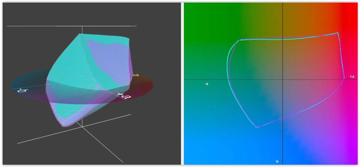
The left image shows the gamut volumes , the right part a horizontal cut through the gamut volume showing the border outlines at a luminance of L*=50 for this discussion. This is the overlay of the gamuts - P400 printer - Sihl or Netbit paper with the same ink. The variances are small enough for further discussion regardless whether I show a profile on the Sihl or the Netbit paper.

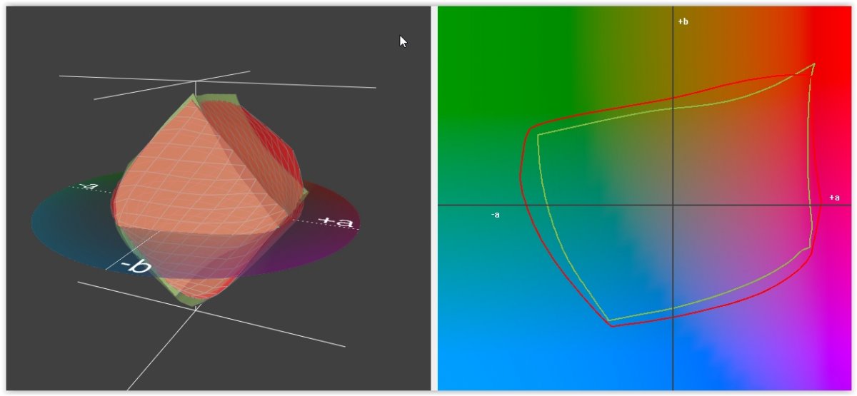
Thanks to @palombian to provide me his Canon Pro-10 Aldi Glossy profile with OEM inks which I plot here against the Epson P400 OEM inks on the Aldi/Netbit paper
Canon-Epson.JPG


the Canon outline boundary is the green line, Epson red on the right, both printers are very strong in the +a+b first quadrant, these are not plots of the OEM profiles, I don't have the P400 Epson profiles anymore on my system. But since most of us - for this or that reason - are not using the OEM inks I did some testing with refill inks - from several well known suppliers - inks made for use with Epson printers, and I used as well inks for use with Canon printers. So stay tuned - I need to get some more diagrams together.
 
Last edited:

Ink stained Fingers

Printer VIP
Platinum Printer Member
Joined
Dec 27, 2014
Messages
5,838
Reaction score
6,965
Points
363
Location
Germany
Printer Model
L805, WF2010, ET8550
The Epson P400 uses red and orange as separate inks but I don't like that too much since it adds more different bottles to my ink inventory. I'm doing this - mixing red and orange from yellow and magenta - red = 2 parts M + 1 part Y, orange = 2 parts Y + 1 part M, and I'm doing this mix as well for all further ink tests i'm going to show you.
I tested various 3rd party refill inks claimed to be compatible and equivalent either with the Ultrachrome K3 or HD or the HiGloss2 ink versions. This thread started off with profiles of the Pro 10, and I happend to test as well some Canon inks - in an Epson printer, that works fine but not the other way around.
I got the CMY PFI-1000 cartridges for the Canon Pro 1000, the latest Canon Lucia Pro inkset, and refilled those inks into the Epson P400 , including the mixed orange and red inks.

Canon orig-PFI1000.JPG


The green line shows the OEM Pro 10 inks - as above, and the blue line the PFI-1000 inks, as described above including the red/orange mixed inks. It is interesting to see how close those outlines are, the PFI-1000 inks perform even better at lower luminance values, at the bottom part of the gamut volumes left, but that would require a more detailed description. I'll keep the focus of the discussion at the L*=50 level. The PFI-1000 cartridges have a much higher volume than those for the Pro10 which results in a significant price drop /ml ink.
I did another test, I used a refill ink suitable for the CLI72 cartridges, those for the Pro 10, and orange and red are mixed here as well

PFI1000-CLI72.JPG


These screen shots show that these CLI72 refill inks have a significantly smaller gamut than the PFI-1000 inks, across all luminance levels from light to dark.
 

Ink stained Fingers

Printer VIP
Platinum Printer Member
Joined
Dec 27, 2014
Messages
5,838
Reaction score
6,965
Points
363
Location
Germany
Printer Model
L805, WF2010, ET8550
Please let me show you now some Epson compatible refill inks, I used the widely used Inktec K3 ink - CMY + those mixed red and orange inks as explained above.

Epson PFI1000-Inktec- K3.JPG

Pink is the outline for the Inktec K3 ink, and blue the outline for the PFI-1000 gamut - now comparing an Epson and a Canon ink. There are actually petty close - closer than I actually expected.

farbenwerk.com in Germany was selling a Pigmera HG2 Epson compatible ink which I tested as well with this result


PFI1000-Pigmera HG2.JPG

The PFI-1000 gamut outline is still blue, the green line shows the Pigmera HG2 gamut, weaker in the +a-b quadrant.
All these gamut tests were done, as mentioned above, on Aldi/Sihl or Netbit papers to maintain comparibility. I tested more inks on more, other papers, but I won't introduce those results here in this context since the other papers add a variable complicating such comparisons. And I'm not discussing here any other effects like bronzing or gloss differences or the black level and the lower gamut range below L=25. Black points and black inks need a separate assessment.
I'm doing all profiling with the i1Profiler package, i1Pro2 and a i1iO rebot arm which does the patch scanning in a few
minutes and offers options of multiple scans to average out reading variations.
 

Artur5

Printer Master
Joined
Jan 24, 2011
Messages
1,294
Reaction score
1,618
Points
278
Location
Kmt. 0.
Printer Model
MB5150,Pro10s,i3Mk3s+,Voron2.4
PerfX Gamut viewer is an useful tool for testing purposes, provided the same instrument and printer are used for making profiles.

When I purchased the Pro10s I was using mainly Epson luster premium and I made several profiles for this paper. One of them for all-OEM ink, another for 9 Octoinkjet inks + OEM Red and the third for 8 Octoinkjet inks + OEM red + Precision Colors magenta.

In the first picture you see outlined in blue the gamut of the OEM ink and in red the gamut of 8 Octoinks + OEM Red + PC magenta.
PC magenta matches very closely OEM ink. Octoinkjet cyans are also a good replica to OEM, although not so close as PC magenta. Therefore, in all the area from pure red to cyan the gamuts of all-OEM ink and Octo + OEM red + PC magenta are very good.
Instead, the parts where yellow is used are a different story. From orange to green OEM gamut is significantly wider than the other.
I conclude that Octoinkjet Cyans and PC magenta are excellent substitutes for OEM.
Octoink Yellow, while not bad, is a bit lacking.

Now the second picture shows outlined in red : 8 Octoinks + OEM Red + PC magenta and outlined in green: 9 Octoinks + OEM Red ( i.e. PC Magenta has been replaced by Octoink )
The results are interesting, Pure magenta is wider with Octoink (see that peak ) but in the surrounding areas, from magenta to red and magenta to blue, PC gives more extension matching closely OEM, as seen in the first picture.
Conclusion for the second comparison: Octoink magenta probably has a higher concentration of pigments, and it’s OK but not perfect for replacing OEM.

What we can’t tell from these graphs is the role played by neutral inks (blacks, gray) and CO.

OEM.vs.Octo+oemred+pcmag.jpg


Octo+OEMRed+PCMag.vs.Octo+OEMRed.jpg
 

palombian

Printer Master
Joined
Feb 4, 2014
Messages
1,869
Reaction score
2,244
Points
297
Location
Belgium
Printer Model
PRO10,PRO9500II,MB5150,MG8250
Thanks @Artur5 :thumbsup.

Based on this the most important colours to pull up the Octoinkjet set near OEM are Y and M.
In addition to PBK.

I tested the Octo CO on papers I use regularly (because I bought them cheap).
It dries slower and is more absorbed by some papers.

On Ilford Smooth Pearl I see no difference (after 10-15 min drying) with PC CO.

On ALDI netBIT the higher absorption is slightly visible at first near zones without ink (in CO automatic settings), they are a bit larger as if the CO is sucked away to neighbour zones. But after a night drying the difference is invisible.
On the test chart with OEM PBK ink I measure a slightly less deeper black (5.2 0.2 -1.5) in comparision with the PC CO (3.6 0.2 -1).

At last, on a very cheap "Everyday Soft Gloss" - unusable on the 9500 because of big gloss differences - no equal gloss was attained with Octo CO even after drying, while the PC CO was able to enhance this paper admirabily.

I still wonder why Canon by default does not apply CO on white zones, this is visible on even their most expensive printers in the showroom and nobody is disturbed.
I try to remove clipped highlights in LR but this does not fill 100% of these zones with ink.
Seems you can apply a mask and saturate lightly but I do not master this technique.

I tested PC CO @Artur5 sent me against the PC72-CO of the Precision Colors Legacy Older Inkset, not the PC72SE-CO of the Signature Edition (which I hope should still be better).


Edit:
 

Ink stained Fingers

Printer VIP
Platinum Printer Member
Joined
Dec 27, 2014
Messages
5,838
Reaction score
6,965
Points
363
Location
Germany
Printer Model
L805, WF2010, ET8550
Both the Canon Pro-10 and Epson P400 use a clear ink, Epson calls it Gloss Optimizer and Canon Chroma Optimizer, expressions which may explain the main purpose of those clear inks. There might be different rules how the drivers apply the GO/CO during printing based on ink density, paper selction and other parameters.
I tested various driver settings with my P400 but none gave me really convincing results. I'm now doing a full separate overprint at this time, I basically use a white page which covers the complete image and applies the GO everywhere, unprinted areas and printed sections alike with the same density.This requires a 2nd print pass but I accept that for better results.
What are the effects - better gloss uniformity across printed and unprinted areas, but the effect strongly depends on the ink/paper combination, a particular ink on a specific paper may show a better gloss, less bronzing than on another paper. Differences are visible as well in the gamuts with and w/o GO overprint

GO Impact.jpg

This screen shows the lower part of the gamuts - on a glossy paper - w/o GO-green and with GO- orange. The gamut with GO is slightly wider everywhere at any luminance level but much wider at the bottom as shown here for L=20.
And all this with an additional effect that the black level drops to almost half of the value w/o GO - as visible in the transparent overlay of both gamuts. This gamut improvement is directly visible in printouts - darker areas have more details and color diffenentiation and better blacks.
This effect is visible on most better glossy photo papers - those which have a PE film barrier and RC coated including the Aldi -Sihl/Netbit papers.
The budget type papers - cast coated - barely show any effect, but I'm not using such papers with pigment inks anyway, the gamut is pretty limited.
 

Ink stained Fingers

Printer VIP
Platinum Printer Member
Joined
Dec 27, 2014
Messages
5,838
Reaction score
6,965
Points
363
Location
Germany
Printer Model
L805, WF2010, ET8550
The Epson P400 and the Canon Pro-10 are using a red ink additionally to the more common CMY inks + gray and light inks, the P400 does not use light inks. Printer companies are explaining this with the benefits of a better reproduction of skin colors, even more with the Epson orange of the P400. Printer companies are competing to acheive the largest overall gamut - 97 or 98 or 99% of Adobe RGB or all Pantone colors etc which makes sense to be able to print company registered colors -like the Coca Cola red etc. But when you look to images with skin colors specifically - portraits etc you can see this; take this portrait as an example which resembles a shot for a cosmetics ad:
Test Image.JPG


The MonacoGamutworks software allows you to display an image in the Lab color space, each image pixel is placed at its Lab color value into the color space which creates a pixel cloud, and I can overlap this view the gamut plot of a particular printer profile showing which pixels are in- or outside the gamut - a kind of soft proof in the Lab color space

Test Image 2.JPG


The pixel cloud of the image above is visible in the left part of the screen shot with all the yellow pixels as they are
distributed, the right image shows a horizontal cut at a luminance of L=70, you see the gamut outline, and that all pixels
are placed inside the gamut, they are not even close to the gamut boundary.
When you look to the bottom of the gamut you see lots of pixels outside the gamut, that's the major part of the dark brown hairs of the model - that's the critical range of colors in this images and not the skin colors at all.
You may have flower images with saturated colors which would benefit from an extended gamut into the red region but the reproduction of typical skin colors, even with make-up , is not limited at all in this area for all practical reasons.

I may add that there is def. a need to be able to print highly saturated colors - just think at photo shots of fashion textiles which may use bright colors , or nature shots of flowers, butterflies and a lot more, but skin colors are typically non saturated.
 
Last edited:

The Hat

Printer VIP
Platinum Printer Member
Joined
Jan 18, 2010
Messages
15,618
Reaction score
8,691
Points
453
Location
Residing in Wicklow Ireland
Printer Model
Canon/3D, CR-10, CR-10S, KP-3
Go easy on me guys, Question;- is all the Friggin around with these tests really necessary to achieve a good print on whatever paper each individual wishes to use, because for the life of me, I have never found a need to do any of this.
Canon orig-PFI1000.JPG
Borrowed Ink stained Fingers Image...

Surly it’s the subject in the print that counts and if the photo image is not good, then all these extras won’t turn a sow’s ear into a silk purse..

At the end of the day does it really make that much difference..:hu
 
Top