Getting correct color match in Canon i960 printer

Trigger 37

Printer Guru
Joined
Dec 23, 2006
Messages
607
Reaction score
4
Points
136
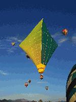
This post is kind of directed to fotofreek, since he has a Canon i960...my note to you is way off topic but I don't see a direct email link to you. I see that you have a i960 printer and I've just fixed one that seems to be working fine. However, I don't llke the color match that I'm getting out of my photo software. I've printed the same picture in 3 different programs and it always comes out exactly the same. The picture prints perfect, but the colors are way too dark and rich. My Royal blue skys come out to be deep dark blue. It seems the color saturation in all prints is way over the top. I have used MS Office Picture Manager, PhotoShop Elements 2.0, and Photoshop 6.0. I've tried it with ICM on and OFF,... manual and auto, no difference. The Paper is Staples Glossy photo which has always come close to Photo Pro. I've also tried some Kirdland Photo paper which has always been the best and I get the same results. The first picture below is the original jpg. The second image was printed in Photoshop 6.0 with the Canon print driver set to manual, no ICM, since I was using Photoshop to print. Anyone with some suggestions would be welcome.


This is the photoshop 6.0 picture,


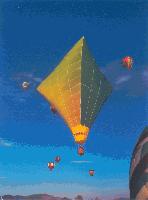
It appears that after I scanned the image, it comes out very close to the original photo. It is no where near as dark and saturated as the i960 print.

Of course I could go in and create a manual profile using the Canon print driver, but I've not had to do that with my iP6600D. I remember I had a very similar problem with my older Canon i560 on high quality photos. They always came out too dark but not as vivid as the i960 prints. I remeber that I spent a lot of time working with the i560, with different papers, software, etc. to get it to print colors that matched. I also spent a lot of time Calibrating my Monitor, and printing color charts and adjusting the colors. I finally gave all that up. With my iP6600 I have had some of that problem, but I alway attribute that to the ink I use and the paper,... and of course, the Canon drivers.

To bad I can't show you the picture as it was printed. My scanner is a Canon 8400F and was set to 300dpi.
 

Trigger 37

Printer Guru
Joined
Dec 23, 2006
Messages
607
Reaction score
4
Points
136
fotofreek,... It seems that once my images are downsized for the upload to this web site, they loose too much photo quality. The bottom image is no where near what the printed picture looks like. All I can do is describe it to you. Now that I look very close to the three pictures I printed, the Photoshop 6.0 print is the worst. I had done a Bicubic resize of the image to print it on a 4x6, and when I compair that print with the Photoshop Elements 2.0 that I did not resize, it is much better. There is a lot of detail that is lost. However, when you don't look that close, the colors are all about the same.

What software do you use to print photos on your i960. What is your setup. What paper and ink do you use. Have you found that much difference in ink. As another test, I just printed the same picture using MS Office Picture Manager on my iP6000D using the same paper and it has precisionColors ink which is "Image Specialist Ink". The picture is very close to the original jpg image I see on my monitor, but again, as with all Canon printers, it is still a little darker. This is always the case since the monitors are so brilliant and ink jet printers can't duplicate the colors of a monitor. especially a wide screen ViewSonic LCD. However, the iP6600 is much much closer to the original. It seems it should be only a case of knowing how much to reduce the color saturation to get it much closer.
 

fotofreek

Printer Master
Platinum Printer Member
Joined
Nov 5, 2004
Messages
1,811
Reaction score
434
Points
253
Location
San Francisco
I've used Kirkland 4x6 paper, MIS ink (reputed to be IS), PSE3 with no color control, printer set to manual color, no ICM, and the print type "auto". I set the paper type to glossy photo. This seems to give me the best skin tones. The other colors appear to be quite close, but skin tones are what I focus on as when they are off the whole picture looks bad. In the past I had print type set to "none" and tweaked the colors in the color bars, but setting the type to "auto" seems to work out best. I had also tried the "photo" type and didn't like it. Give it a try and let me know how it works out. I do believe that there can be some variability between two same model printers! Try it and get back to me. I just bought a set of inks from Mikling as well. I'd rather buy IS inks from him - he's been a good supporter of this Forum, and he identifies his ink source.

I've also found that the most difficult pix to get decent color balance with are those with mixed light source temperatures. Night indoor pictures with ambient incandescent light and flash are the worst. Subjects within the appropriate range of the flash look good, but as the distance increases from the camera, faces take on the warmer light of the ambient incandescent light source. My digital cameras are in the middle range of the consumer cameras, and they do perform best under daylight conditions with adeqate light. As the light diminishes and the camera shifts to a higher ISO the image does degrade.

I carried SLR film cameras with several different focal lengths all over Europe and Southeast Asia for years - before decent quality zoom lenses were available. I vowed to stop lugging all that equipment and went for the first long tele (10x) fully adjustable non SLR digital when it became available. Not quite "pocketable", but small and light enough to not be a burden. I've been soredly tempted to go for a professional grade digital SLR to get away from shutter lag and low light image degradation, but I just hate to move up to the size camera that this entails.
 

tyamada

Printer Guru
Joined
Nov 11, 2004
Messages
178
Reaction score
0
Points
109
Trigger 37

You can get a program called Profile Prism from this site. http://www.ddisoftware.com/prism/
I've used it for years and am very pleased with the results. I just re-profiled my Canon i9900 because I started to use some of the Canon inks I have left, I never used Canon's Inks before. I refilled with all different 3rd party inks and used Profile Prism to get my prints to come out with the proper colors. The price is reasonable considering the price of other software or purchased profiles. This way when you change inks you can profile to your hearts content.
 

Trigger 37

Printer Guru
Joined
Dec 23, 2006
Messages
607
Reaction score
4
Points
136
fotofreek,...thanks for all the info. I've rechecked all my samples and the Photshop Elements 2.0 (which is what I have) did the best job of matching the colors, but as the link that tyamada provided indicated in great detail, Printer can not reproduce the large range of "Blues" that a monitor can. What is dark blue sky tends to come out almost purble, as too much Photo black is added. I tried the manual mode with "Auto" but that did not help much. I also tried messing with "Intensity" and that helped some but by the time I got the sky to look correct, all the other colors were washed out. The controls that Canon provides inside there driver make no sense to most people that work on Color Photos. For example they have an "Intensity Control",.. which I've never seen in any Photo Editing software, and here is what they say about it; Intensity

Adjusts the overall lightness or darkness of printing. Drag the slider to the right to darken the overall printing result, and to the left to lighten the overall result.


I don't even think that words like "lightness, or darkness" are used in photo printing. It is nothing like "Brightness & Contrast". Then they actually have their "Brightness" controls with the only options of "Light, Normal, or Dark" as if this is nothing but a switch. Here is what they say about it;

Brightness

Selects the brightness of printing.

You cannot change the levels of pure white and black but you can change the contrast of the colors between white and black.

I may be stupid but none of this makes any sense to me. The should have a real Brightness & Contrast control, and along with the colors, they need "Saturation Level"

As far as Profile Prism, Im'm sure it is a fantastic program and the results will be very accurate,but I'm not submitting photos to a magazine, I just want them to look right. I thing fotofreek has it right, if you can get the skin tones correct, then people will feel the picture is correct. The problem with sceneary is that no one was there except you and they don't have a clue what it looks like. However, people do know what the sky looks like and many other things. They want the picture to look "Natural". Problem is, when people see it on a monitor and then the print, they are alway somewhat dissapointed because you were not able to reproduce what they saw on the screen.

I use a similar process that Profile Prism uses, but it is all done manually. I start with the final paper stock, 8x10, and cut it into 4 pieces. I'll do this to several sheets.
Then I'll print one of the color test charts like the ones that Neil uses. I'll adjust the color level until I can get the skin tones to match, then I'll increase or decrease all colors the same amount in an attempt to increase or decrease the saturation level. I also have a CMYK color wheel, which is a great help in adjusting colors. Once I get an acceptable match, I save the results as a profle in the Canon driver. If the driver had the other controls that I mentioned above, it would be ten times easier to do this.
 

fotofreek

Printer Master
Platinum Printer Member
Joined
Nov 5, 2004
Messages
1,811
Reaction score
434
Points
253
Location
San Francisco
Trigger - With skin tones looking good you will still see a sweater or blouse that is a slightly different color from what the garment really looks like. Shifting the manual controls to get everything balanced is most difficult to impossible. Adjusting one color throws the others out of whack. Custom profiles are best for those who demand the most accurate colors. I'm more than satisfied with my pix, and people I give them to really like the quality, color, etc.

Canon OEM inks with the Canon profiles tend, in the i960 and probably other Canon printers as well, to produce oversaturated prints. I would guess that most people like them that way. It brings to mind something that anyone younger than the late 60's of asge won't remember. The first color film I used was Kodachrome - slide film with an ASA (now known as ISO) of 10! It was only balanced for daylight or flash pix. The pictures were beautiful, but the colors were more vibrant than the actual scene. Ektrachrome then came out at ASA 25 - a big jump in sensetivity. It was more nomal in color rendition, but it tended to produce slightly "colder" slides. Then came film that was balanced for incandescent light - useful for artificial available lilght shots or floods and spots that were incandescent color temp. It took lots of years to get decent film that had high ASA ratings. Still needed to use the correct film for daylight or artificial lighting, or you used filters to compensate. Much easier now with multiple ISO settings and auto or custom white balance built into all the digital cameras!
 
Top