l_d_allan
Fan of Printing
From mikling earlier this year
I've printed out a variety of Kodak-like test prints, and looked at them closely. I really can't tell much difference ... both look really good to me. Based on my limited experience, the iP4500 is simpler to use because it tends to use up color ink more evenly so I have fewer delays to replace PC and PM carts.
I was wondering if other owners with the 9000-2 and a simpler Canon PIXMA CMYK printer can tell much difference. Perhaps I am ignorant about what to look for? Or deficient eye-sight?


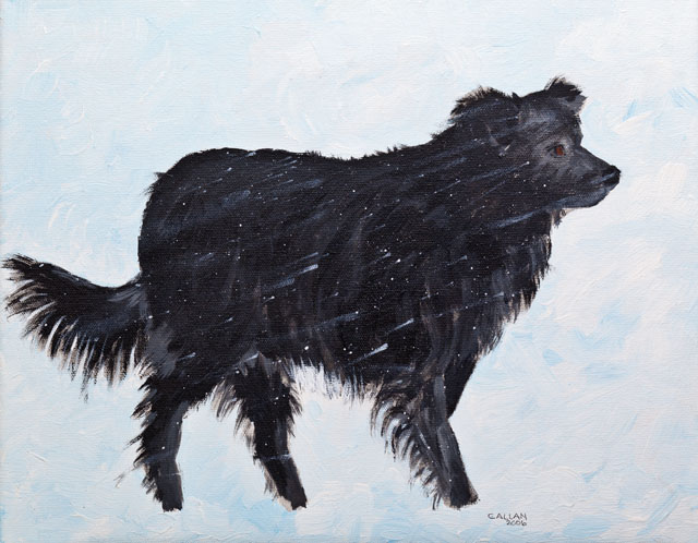
The last three are photos of pictures painted by wife. I find this to be a good test of my entire front-to-back color management because I can compare to the original painting in controlled lighting:
* Does the original painting look like the monitor image to test monitor calibration? (using an Ott Lite to illuminate the painting)
* Does the monitor image look like the print to test printer profile?
* Does the original painting look like the print to test front-to-back color management?
To distinquish between different prints made with different settings, I add a text layer to the original .tif images and include the settings for the print, including:
* date
* printer (iP4500 vs 9000-2)
* Ink used (OPC vs Canon oem)
* Paper used (Kirkland vs Canon vs etc.)
* Profile used, or Printer-Manages-Color:Auto
* MediaType (PlusGlossy2 vs Matte vs etc.)
* Quality (High vs Standard vs Fast)
* Xps (16-bit or 8-bit print driver ... unclear if it matters with Windows?)
* Black Point Compensation
* RenderingIntent (Relative-Colorimetric vs Perceptual vs Saturation vs etc.)
* Software application (Photoshop vs Canon DPP vs Canon EasyPhotoPrintEx vs etc.)
* Other settings that may apply to your circumstances?
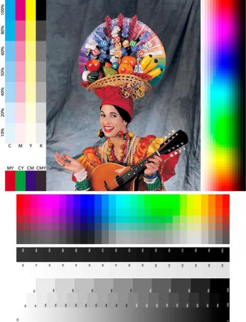
I wasn't able to find the first image (Adobe ColorFile.tif) on the internet, but was able to obtain a copy (thanks Wil). At the risk of infringing on I.P. here is a link to the non-text-layer version , and a text-layer version .
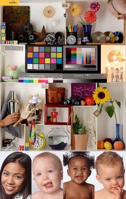
The third image is from the website of the author of "Fine art printing for photographers : exhibition quality prints with inkjet printers", by Uwe Steinmueller. Here is an essay explaining what to look for when evaluating a print made from the .tif file. And a link to a .tif file with a text layer (70mb .tif file)
I've got a Canon PIXMA Pro 9000-2 and also an iP4500. Both use CLI-8 carts ... the ip4500 has CMYK + PGI-5bk ... the 9000-2 has CMYK + Red + Green + PhotoMagenta + PhotoCyan.I always had a suspicion about the marketing gimmicks with the printer manufacturers. My suspicion was profound because I had long noticed that the more expensive printers did not produce the expected superiority. Add to this the aspect that there are many misconceptions about the number of inks and the image quality.
So I was wondering about the differences between the print quality of the MG8120 and the iP4820. The MG8120 is a much more expensive printer than the iP4820. Yes, it is a multifunction unit etc. And then again it sported an extra grey cartridge to be used in B&W output. But what about the print quality or exactly what was the difference in color ??????
I've printed out a variety of Kodak-like test prints, and looked at them closely. I really can't tell much difference ... both look really good to me. Based on my limited experience, the iP4500 is simpler to use because it tends to use up color ink more evenly so I have fewer delays to replace PC and PM carts.
I was wondering if other owners with the 9000-2 and a simpler Canon PIXMA CMYK printer can tell much difference. Perhaps I am ignorant about what to look for? Or deficient eye-sight?

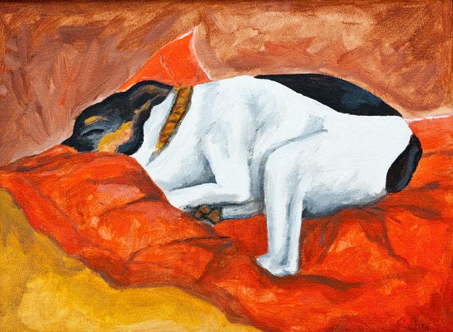
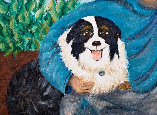
The last three are photos of pictures painted by wife. I find this to be a good test of my entire front-to-back color management because I can compare to the original painting in controlled lighting:
* Does the original painting look like the monitor image to test monitor calibration? (using an Ott Lite to illuminate the painting)
* Does the monitor image look like the print to test printer profile?
* Does the original painting look like the print to test front-to-back color management?
To distinquish between different prints made with different settings, I add a text layer to the original .tif images and include the settings for the print, including:
* date
* printer (iP4500 vs 9000-2)
* Ink used (OPC vs Canon oem)
* Paper used (Kirkland vs Canon vs etc.)
* Profile used, or Printer-Manages-Color:Auto
* MediaType (PlusGlossy2 vs Matte vs etc.)
* Quality (High vs Standard vs Fast)
* Xps (16-bit or 8-bit print driver ... unclear if it matters with Windows?)
* Black Point Compensation
* RenderingIntent (Relative-Colorimetric vs Perceptual vs Saturation vs etc.)
* Software application (Photoshop vs Canon DPP vs Canon EasyPhotoPrintEx vs etc.)
* Other settings that may apply to your circumstances?
I wasn't able to find the first image (Adobe ColorFile.tif) on the internet, but was able to obtain a copy (thanks Wil). At the risk of infringing on I.P. here is a link to the non-text-layer version , and a text-layer version .
The third image is from the website of the author of "Fine art printing for photographers : exhibition quality prints with inkjet printers", by Uwe Steinmueller. Here is an essay explaining what to look for when evaluating a print made from the .tif file. And a link to a .tif file with a text layer (70mb .tif file)