A basic guide (see post #1) to setting up ARGYLL CMS profiling on your computer

Ink stained Fingers

Printer VIP
Platinum Printer Member
Joined
Dec 27, 2014
Messages
5,851
Reaction score
6,981
Points
363
Location
Germany
Printer Model
L805, WF2010, ET8550
I'm not getting decent gray values on the gray patches - not with the Argyll nor with the i1Profiler profiles , there is something wrong in the overall flow - profiling - printing - rendering intent - whatever . I'll have to debug that before I do any further comparisons
 
Last edited:

pharmacist

Printer VIP
Platinum Printer Member
Joined
May 29, 2007
Messages
2,564
Reaction score
1,269
Points
313
Location
Ghent, Belgium
Printer Model
Epson SC-P800,WF-7840,XP-15000
Hi ISF,

Pictures you printed with the three profiles arrived today and I had look at them see PM about my preliminary opinion about it.
 

Ink stained Fingers

Printer VIP
Platinum Printer Member
Joined
Dec 27, 2014
Messages
5,851
Reaction score
6,981
Points
363
Location
Germany
Printer Model
L805, WF2010, ET8550
As described above I created 2 profiles with i1Profiler - one based on 96 patch fields and one with 283 patch fields, and I'm using an ArgyllCMS profile for my L1800 printer which @pharmacist created for me. These 3 profiles were used for the above gamut comparison, and I printed the printer evaluation sheet - posting #440 - with these 3 profiles as well which I sent to @pharmacist for review.

I'm surprised how close the 3 prints look overall, as well under different light conditions - roomlight - artificial light - daylight - sun or overcast which all means different color temperatures for the viewing conditions. I see slightly more saturation in the skin tones under daylight with the ArgyllCMS profile - the i1 profile prints look identical. But this all only in direct comparison - I asked 2 other people less involved in color mgmt issues - and they told me - hey - the prints look the same.

And I see some better gray definition at the dark left side of the gray ramp at the bottom at patch field #2 for the ArgyllCMS print - this under daylight, lower brightness under artificial light let these differences disappear.

The test image above is of a rather low resolution, it is interesting to see that the printer/ink/paper/profile combination can actually resolve compression artifacts along edges.

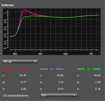
The ColorMunki used by @pharmacist blocks UV light from the light source - M2 measurement condition - and does not record changes in the whitepoint caused by the optical brighteners, and the Netbit paper uses quite a lot of those .
Thsi spectral plot shows the impact of the optical brighteners in the Netbit paper, you would need to create a profile for a viewing environment without and a separate profile for some UV in the viewing light situation, and you may have to change the viewing light color temperature as well - daylight D65 vs. D50 as the universal standard value. There is a significant difference in the b-value for these conditions.

OBA Impact.jpg

Such variations and adjustments would have an impact on the overall look of a print - with a tendency to a warmer or cooler look.

Let me conclude that I don't really see obvious differences between the prints profiled with ArgyllCMS or i1profiler, and I'm positively surprised that I just need 96 color patches for quite good prints. But this review does not cover specific issues with B/W printing - neutrality of grays and not with particular needs to exactly replicate specific Pantone or Munsell or DIN or ...... colors.
 
Last edited:

The Hat

Printer VIP
Platinum Printer Member
Joined
Jan 18, 2010
Messages
15,623
Reaction score
8,695
Points
453
Location
Residing in Wicklow Ireland
Printer Model
Canon/3D, CR-10, CR-10S, KP-3
Let me conclude that I don't really see obvious differences between the prints profiled with ArgyllCMS or i1profiler, and I'm positively surprised that I just need 96 color patches for quite good prints
If you’re happy with the conclusions and results you have achieved in collaboration with @pharmacist, then I reckon they are more than credible and at best better than what’s been produced previous, your field tests are more creditable than any lab could produce, because there’re in real time..

Fantasist work..:hugs
 

nertog

Print Addict
Joined
Jun 30, 2009
Messages
156
Reaction score
82
Points
161
Location
Regensburg, Germany
Printer Model
Epson R3000 - PX720 - P50
I´ll print out a few color patches spread over my R3000´s gamut later this evening and measure them. Let's see...
As promised: a quick check of the absolute colorimetric accuracy of my printer-profile combo.

Printer: Epson Stylus Photo R3000
Profile: 779 patches, ArgyllCMS, X-rite Eye One Rev. D
Test target: 8 saturated LAB-values inside the profile gamut + 1 neutral patch printed using absolute colorimetric rendering

img029.jpg


Results in deltaE 1976 (deltaE 2000)

Yellow: 6.7 (3.2)
Red: 9.9 (3.1)
Magenta: 4.7 (2.1)
Purple: 3.7 (1.5)
Blue: 2.7 (1.9)
Cyan: 8.9 (3.9)
Green: 9.6 (2.8)
Lime: 6.5 (2.0)
Grey: 2.8 (2.8)

To summarize: these are relatively large deltas. I am not sure if this is normal or not, but besides some hue changes in blue-cyan sky tones I cannot detect any differences between prints and monitor softproof (everything calibrated + a proper viewing environment). Everything looks great on print.

Keep in mind that dE1976 is actually not the best formula to evaluate perceptual color differences. I am big fan of the updated dE2000.

If anyone wants to repeat this test: I attached the target as a .TIFF file.
 

Attachments

  • Profile_check.rar
    103.9 KB · Views: 177
Last edited:

Ink stained Fingers

Printer VIP
Platinum Printer Member
Joined
Dec 27, 2014
Messages
5,851
Reaction score
6,981
Points
363
Location
Germany
Printer Model
L805, WF2010, ET8550
Thanks for your test and feedback, I'm aware that the DeltaE2000 better matches numerical and visual color variations but I'm not really doing any visual tests of this type, I just like to have a numerical value for color differences I can use for comparison, and they are supposed to be small anyway.

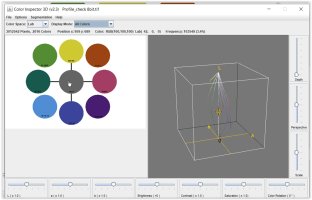
I'm looking to your circled color patches and wonder if we are using the same scales and measures - I converted the file down to RGB 8 bit accuracy, and my graphics program tells me that the gray patch has a color of R=G=B=100 which is about 40% of 255, you specify a Lab value of 50, 0 , 0 - L=50 is the midpoint of the L-axis from 0 to 100 , which would correspond to a RGB=127 value - not 100 - I see similar differences with all the other colors - is there a hidden Gamma or another factor causing this ?

Printtest.JPG

Have a look to the numbers just above the graphs showing the Lab and RGB values when you mouse over the
color patches when you use this Java program.
Your file contains plenty more colors than 9 - 2016 in total - which are caused by the interpolation around the
coutline circles, and all these colors are shown as little dots in the Lab space. You may better use rectangles to prevent this.

I think your measured color deltas are pretty small overall , I hope I can get to similar results as well.
 

nertog

Print Addict
Joined
Jun 30, 2009
Messages
156
Reaction score
82
Points
161
Location
Regensburg, Germany
Printer Model
Epson R3000 - PX720 - P50
I'm looking to your circled color patches and wonder if we are using the same scales and measures - I converted the file down to RGB 8 bit accuracy, and my graphics program tells me that the gray patch has a color of R=G=B=100 which is about 40% of 255, you specify a Lab value of 50, 0 , 0 - L=50 is the midpoint of the L-axis from 0 to 100 , which would correspond to a RGB=127 value - not 100 - I see similar differences with all the other colors - is there a hidden Gamma or another factor causing this ?

View attachment 14691

It seems you are not using the embedded ProphotoRGB (gamma=1.8) color space, but likely sRGB or Adobe RGB. I double checked the RGB numbers in the correct color space and it should translate to the LAB values I wrote down. E.g. RGB (prophotoRGB) 100,100,100 = LAB 50,0,0.
 

pharmacist

Printer VIP
Platinum Printer Member
Joined
May 29, 2007
Messages
2,564
Reaction score
1,269
Points
313
Location
Ghent, Belgium
Printer Model
Epson SC-P800,WF-7840,XP-15000
Just an update from my side:

My first impression is the i1 profiles tends to be cooler than the ArgyllCMS profile (the facial tone of the people especially the right baby look rather pale to my eye). I also have a look at the contrast of the grey inside the dark bar on the left side underneath (numbering from 2 tot 24). worse: 96 patch i1, better: 283 patch i1, best contrast: 484 ArgyllCMS. Dark blues are better with the i1 profiles (both 96 and 283), but reds, magenta and yellows are better reproduced by ArgyllCMS. Also the white to full black ramp in the middle is best with the ArgyllCMS (especially the dark grey blocks near pure black: the i1 96 and less the i1 283 tends to block towards black). But I see almost no difference between the i1 96 vs 283 patch targets. For better gray ramps the ArgyllCMS (128 steps) is superior to the i1 profiles with only a limited amount of gray patches. In the past my 480target.tif target seems to outperform larger patch targets in ArgyllCMS, probably due to the -G128 argument in the targen command and combined with the -N0.75 argument taking more points around the neutral axis, which is visually the most important for getting visually the most neutral prints (as pointed by @mikling).

Mostly I use the standard Colormunki profiling software in two steps by which the second target is depending on the data obtained by the reading of the first patches combined by 2 optimizations using two images: one with real world images and a second with out of gamut colours, gray ramps and skin tones of different peoples. Nevertheless the ArgyllCMS 480target produces superior profiles to the Colormunki method even the latter one using 2x optimizations.
 
Last edited:

Ink stained Fingers

Printer VIP
Platinum Printer Member
Joined
Dec 27, 2014
Messages
5,851
Reaction score
6,981
Points
363
Location
Germany
Printer Model
L805, WF2010, ET8550
It seems you are not using the embedded ProphotoRGB (gamma=1.8) color space,
Yes, that was my oversight, I checked and yes - there is the ProPhotoRGB color space which includes a gamma value which I somehow expected ; I typically use sRGB on this level which needs less attention overall
 

Ink stained Fingers

Printer VIP
Platinum Printer Member
Joined
Dec 27, 2014
Messages
5,851
Reaction score
6,981
Points
363
Location
Germany
Printer Model
L805, WF2010, ET8550
I'm not giving up yet and think I found a way 'hack' a data file used by i1Profiler, data which is used to define a patch sheet layout and to inject there some other data from a scan. I'll do some tests to see if that works. I'm still trying to compare scanned data with the original patch colors - a process which is otherwise hidden to the user.
 
Top