- Joined
- Feb 24, 2005
- Messages
- 1,669
- Reaction score
- 183
- Points
- 223
- Location
- North of Boston, USA
- Printer Model
- Canon i9900 (plus 5 spares)
This is the first of several discussions on inks and their use in inkjet printers. The "FNO" is short for "For Nerds Only" to warn those who aren't interested in the technical details that they might want to skip any post with this warning.
As was stated in a previous post, I am not an expert in these subjects so feel free to correct any misleading statements or errors. I have not found much detailed information on these subjects on other sites, so I decided to do my own research and post what I think that I have learned. Most of these posts will present data gathered from a spectrophotometer, and a quick explanation/description of these displays was given in (http://www.nifty-stuff.com/forum/viewtopic.php?pid=2938#p2938) for those who want to follow these posts.
When considering how inks generate colors, it is instructive to start by looking at how our eyes sense various colors. This link (http://www.photo.net/photo/edscott/vis00010.htm) provides a good explanation of the 3 sets of color sensors in out eyes and gives the wavelengths that trigger each sensor.
Computer displays (monitors/LCDs) create colors by combining their Red/Green/Blue light sources in varying strengths, and are called additive color systems because the 3 colors add together to generate the light that we see (http://www.photo.net/photo/edscott/rep00020.htm).
Printers use inks to create their colors, and they use a completely different approach - an external light source illuminates the printed image and we only see the portion of the light that is reflected back from the paper to our eyes. On unprinted paper we see the full spectrum of light that the paper reflects, and the whitest color that can be seen is controlled by the light source and the "whiteness" of the paper. In the case of photo inkjet paper, the light must be transmitted through the nanoporous or swellable surface layers to a base layer of plastic containing a high concentration of white (usually Titanium Dioxide - a very "white" pigment). The light then bounces off the TiO2 and back through the same surface layers before it reaches our eyes. When there are no inks on the paper, you should see an "almost white" color, since almost the full spectrum of colors are reflected by a good paper (http://www.nifty-stuff.com/forum/viewtopic.php?pid=2943#p2943).
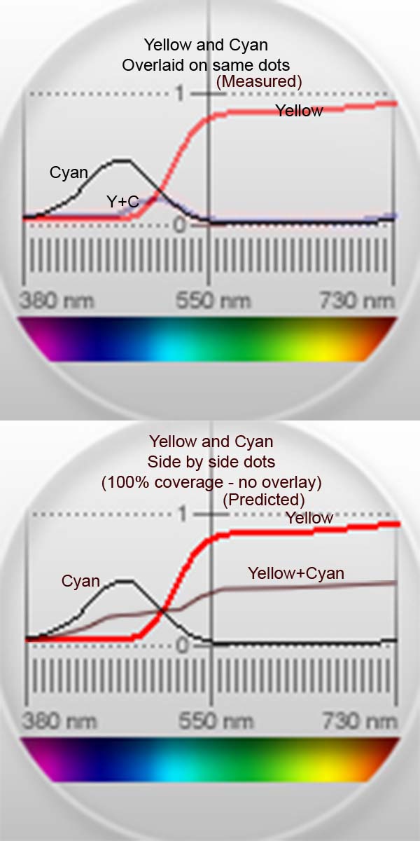
When inks are printed on the paper, each ink color absorbs a certain range of colors, leaving only the colors that aren't absorbed by the ink to reach our eyes. This is a "subtractive system", since each ink color removes certain wavelengths from the light that is reflected back to our eyes. The top image (below) shows the wavelengths that are absorbed by yellow and cyan inks. The yellow almost completely absorbs any light with a wavelength below about 500 nm, but passes most light with a wavelength above 550 nm (the green/yellow/red regions), giving an average perceived color of yellow. The same image shows that cyan absorbs much more of the light, passing only about 50% of the light in the 430-510 nm band and absorbing both shorter and longer wavelengths.
The most interesting data on this image is what happens when cyan and yellow are painted on top of each other. The yellow absorbs the short wavelengths and the cyan absorbs the long wavelengths, so there is only a narrow band of colors in the 480-530 nm range that are reflected by this ink combination (all 3 curves are actual data). The result is that the combination of yellow and cyan gives a very dark blue-green color, not at all like the bright green that would be expected by mixing yellow and cyan. Instead of printing the inks directly on top of each other, suppose that they were printed in small dots alongside each other such that 100% of the paper was covered, but with only one of the two inks at any point. In this case, the average of the reflected light would be an average of the two absorption curves, as shown on the bottom image (this is predicted - I have no way to actually print this test pattern). Note the large difference in the two composite spectra - this would result in two very different colors.
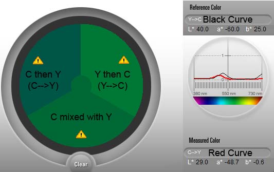
The composite color brought up another subject for investigation - "Does it make a difference in which order the colors are painted?". To check this, one swatch was painted with cyan and then yellow, a second swatch was painted with yellow and then cyan and a third was painted with a mixture of cyan and yellow inks. In an attempt to control the color level, a fresh swab was used for each swatch and loaded with 8 drops of ink (dropped from a blunt #18 needle) before painting. Also, the second color was painted as soon as possible after the first color was applied - usually within 3-5 seconds. The swatches were allowed to dry for 24 hours and measured, with the results presented below. Samples of the three colors are shown on the left. (C-->Y) was painted with cyan and then yellow, and is the darkest of the three. The absorption curve for this color is shown in red on the right. (Y-->C) was painted with yellow and then cyan, and is the lightest of the three - it's absorption curve is shown in black on the right. (C Mixed with Y)'s color falls between the other two colors on the left, and its spectrum is also between the other two (not shown). This data shows that if more than one ink is applied at any point on the paper that the order of the ink's application can make a big difference in the final color. Since the printer should obviously be programmed to attempt to prevent dots from falling on top of each other to get the best colors, it is now clear why the print head alignment procedure is so important. If the heads are not properly aligned, more ink dots could overlay on top of each other and affect the color. This is apparently what happens, as one of the first steps in troubleshooting a color problem is to align the print heads (and this lengthy, meandering explanation has a practical application after all).
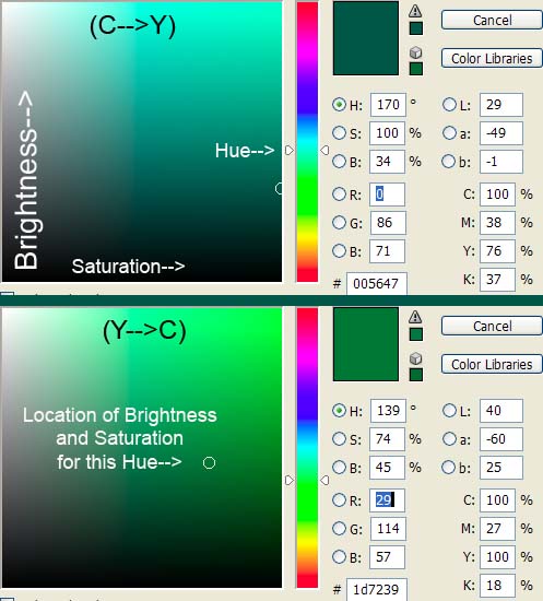
This image shows the (C-->Y) [top] and (Y-->C) [bottom] Lab color values when they were input to Photoshop's color selector so that they could be seen on a Hue/Saturation/Brightness (HSB) display. There is a sizable (31 degree) shift in the Hue (base color) of these two colors, as well as sizable differences in the Saturation and Brightness - this is not just a simple shift in the color's intensity.
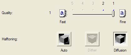
There is a photo of how an i9900 inkjet printers lays down its individual ink dots in the post at (http://www.nifty-stuff.com/forum/viewtopic.php?id=392). This photo shows that the color dots from a 2 Pico liter printer are about 60 microns in diameter. The following options also affect how the dots are laid down - I am told that "Diffusion" is the proper option to select for printing photos to get the best colors on Canon printers.
Qimage states that Canon printers have a native resolution of 600x600 ppi, but my i9900 literature claims a "print resolution" of 4800x2400 dpi (4800x1200 at the bottom edge). I interpret these numbers to mean that the printer works with "color boxes" that are 600/in (40 microns on a side - a good match for 60 micron ink dots), but that it can place a dot of ink at any of 4800x2400 locations/inch across the paper (a 5x10 micron grid) to attempt to prevent individual ink dots from overlaying on top of each other. Clearly, this is not always possible (especially for the darker colors), as was shown in the photo in the previous post.
There are a few more points that should also be mentioned:
1. It might seem like overlaying dots of ink would always arrive at the almost same time and therefore always act as a mixture, but it is far more likely for them to arrive at different times. When you terminate a print in the middle of printing, you get a band approximately the width of the head where the colors are gradually built up by successive passes fo the print head. It typically takes about 8 passes to lay down enough ink to form the final image, so it is 7 times more likely for one dot of ink to land on top of the other on a different pass than to arrive on the same pass and be mixed.
2. There appears to be a limited quantity of mordants (substances used to set dyes) in the coatings on the papers. Note that the right end of the (C-->Y) curve allows very little light to be reflected at the longer wavelengths (just like the cyan ink), while the (Y-->C) curve lets about 25% of the light reflect at the longer wavelengths. The simplest explanation for this situation is that most of the mordants in the coatings are used up by the first ink (yellow) to hit the paper. It also explains why the colors are different for (C-->Y) than for (Y-->C) [the first ink has more effect].
3. The yellow triangles with an "!" indicate that the colors measured by the spectro are outside the gamut of my LCD display. Even thought this is the case, the relative intensity of the colors on this image still give a good idea of the relative differences on the swatches.
4. It is clear that this is a very complicated subject and that we have much to learn. It was far from obvious that how the printer lays down the ink could have such a large effect on the final color.
Is there much interest in these types of subjects? Is the N-S forum the proper place to post this information?
As was stated in a previous post, I am not an expert in these subjects so feel free to correct any misleading statements or errors. I have not found much detailed information on these subjects on other sites, so I decided to do my own research and post what I think that I have learned. Most of these posts will present data gathered from a spectrophotometer, and a quick explanation/description of these displays was given in (http://www.nifty-stuff.com/forum/viewtopic.php?pid=2938#p2938) for those who want to follow these posts.
When considering how inks generate colors, it is instructive to start by looking at how our eyes sense various colors. This link (http://www.photo.net/photo/edscott/vis00010.htm) provides a good explanation of the 3 sets of color sensors in out eyes and gives the wavelengths that trigger each sensor.
Computer displays (monitors/LCDs) create colors by combining their Red/Green/Blue light sources in varying strengths, and are called additive color systems because the 3 colors add together to generate the light that we see (http://www.photo.net/photo/edscott/rep00020.htm).
Printers use inks to create their colors, and they use a completely different approach - an external light source illuminates the printed image and we only see the portion of the light that is reflected back from the paper to our eyes. On unprinted paper we see the full spectrum of light that the paper reflects, and the whitest color that can be seen is controlled by the light source and the "whiteness" of the paper. In the case of photo inkjet paper, the light must be transmitted through the nanoporous or swellable surface layers to a base layer of plastic containing a high concentration of white (usually Titanium Dioxide - a very "white" pigment). The light then bounces off the TiO2 and back through the same surface layers before it reaches our eyes. When there are no inks on the paper, you should see an "almost white" color, since almost the full spectrum of colors are reflected by a good paper (http://www.nifty-stuff.com/forum/viewtopic.php?pid=2943#p2943).
When inks are printed on the paper, each ink color absorbs a certain range of colors, leaving only the colors that aren't absorbed by the ink to reach our eyes. This is a "subtractive system", since each ink color removes certain wavelengths from the light that is reflected back to our eyes. The top image (below) shows the wavelengths that are absorbed by yellow and cyan inks. The yellow almost completely absorbs any light with a wavelength below about 500 nm, but passes most light with a wavelength above 550 nm (the green/yellow/red regions), giving an average perceived color of yellow. The same image shows that cyan absorbs much more of the light, passing only about 50% of the light in the 430-510 nm band and absorbing both shorter and longer wavelengths.
The most interesting data on this image is what happens when cyan and yellow are painted on top of each other. The yellow absorbs the short wavelengths and the cyan absorbs the long wavelengths, so there is only a narrow band of colors in the 480-530 nm range that are reflected by this ink combination (all 3 curves are actual data). The result is that the combination of yellow and cyan gives a very dark blue-green color, not at all like the bright green that would be expected by mixing yellow and cyan. Instead of printing the inks directly on top of each other, suppose that they were printed in small dots alongside each other such that 100% of the paper was covered, but with only one of the two inks at any point. In this case, the average of the reflected light would be an average of the two absorption curves, as shown on the bottom image (this is predicted - I have no way to actually print this test pattern). Note the large difference in the two composite spectra - this would result in two very different colors.
The composite color brought up another subject for investigation - "Does it make a difference in which order the colors are painted?". To check this, one swatch was painted with cyan and then yellow, a second swatch was painted with yellow and then cyan and a third was painted with a mixture of cyan and yellow inks. In an attempt to control the color level, a fresh swab was used for each swatch and loaded with 8 drops of ink (dropped from a blunt #18 needle) before painting. Also, the second color was painted as soon as possible after the first color was applied - usually within 3-5 seconds. The swatches were allowed to dry for 24 hours and measured, with the results presented below. Samples of the three colors are shown on the left. (C-->Y) was painted with cyan and then yellow, and is the darkest of the three. The absorption curve for this color is shown in red on the right. (Y-->C) was painted with yellow and then cyan, and is the lightest of the three - it's absorption curve is shown in black on the right. (C Mixed with Y)'s color falls between the other two colors on the left, and its spectrum is also between the other two (not shown). This data shows that if more than one ink is applied at any point on the paper that the order of the ink's application can make a big difference in the final color. Since the printer should obviously be programmed to attempt to prevent dots from falling on top of each other to get the best colors, it is now clear why the print head alignment procedure is so important. If the heads are not properly aligned, more ink dots could overlay on top of each other and affect the color. This is apparently what happens, as one of the first steps in troubleshooting a color problem is to align the print heads (and this lengthy, meandering explanation has a practical application after all).
This image shows the (C-->Y) [top] and (Y-->C) [bottom] Lab color values when they were input to Photoshop's color selector so that they could be seen on a Hue/Saturation/Brightness (HSB) display. There is a sizable (31 degree) shift in the Hue (base color) of these two colors, as well as sizable differences in the Saturation and Brightness - this is not just a simple shift in the color's intensity.
There is a photo of how an i9900 inkjet printers lays down its individual ink dots in the post at (http://www.nifty-stuff.com/forum/viewtopic.php?id=392). This photo shows that the color dots from a 2 Pico liter printer are about 60 microns in diameter. The following options also affect how the dots are laid down - I am told that "Diffusion" is the proper option to select for printing photos to get the best colors on Canon printers.
Qimage states that Canon printers have a native resolution of 600x600 ppi, but my i9900 literature claims a "print resolution" of 4800x2400 dpi (4800x1200 at the bottom edge). I interpret these numbers to mean that the printer works with "color boxes" that are 600/in (40 microns on a side - a good match for 60 micron ink dots), but that it can place a dot of ink at any of 4800x2400 locations/inch across the paper (a 5x10 micron grid) to attempt to prevent individual ink dots from overlaying on top of each other. Clearly, this is not always possible (especially for the darker colors), as was shown in the photo in the previous post.
There are a few more points that should also be mentioned:
1. It might seem like overlaying dots of ink would always arrive at the almost same time and therefore always act as a mixture, but it is far more likely for them to arrive at different times. When you terminate a print in the middle of printing, you get a band approximately the width of the head where the colors are gradually built up by successive passes fo the print head. It typically takes about 8 passes to lay down enough ink to form the final image, so it is 7 times more likely for one dot of ink to land on top of the other on a different pass than to arrive on the same pass and be mixed.
2. There appears to be a limited quantity of mordants (substances used to set dyes) in the coatings on the papers. Note that the right end of the (C-->Y) curve allows very little light to be reflected at the longer wavelengths (just like the cyan ink), while the (Y-->C) curve lets about 25% of the light reflect at the longer wavelengths. The simplest explanation for this situation is that most of the mordants in the coatings are used up by the first ink (yellow) to hit the paper. It also explains why the colors are different for (C-->Y) than for (Y-->C) [the first ink has more effect].
3. The yellow triangles with an "!" indicate that the colors measured by the spectro are outside the gamut of my LCD display. Even thought this is the case, the relative intensity of the colors on this image still give a good idea of the relative differences on the swatches.
4. It is clear that this is a very complicated subject and that we have much to learn. It was far from obvious that how the printer lays down the ink could have such a large effect on the final color.
Is there much interest in these types of subjects? Is the N-S forum the proper place to post this information?
