You are using an out of date browser. It may not display this or other websites correctly.
You should upgrade or use an alternative browser.
You should upgrade or use an alternative browser.
New PrinterKnowledge header image
- Thread starter Support
- Start date
Smudger
Fan of Printing
- Joined
- Apr 4, 2015
- Messages
- 65
- Reaction score
- 70
- Points
- 58
- Location
- London
- Printer Model
- IX6850, IP7250
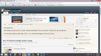
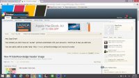
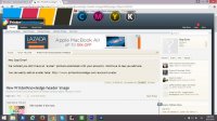
Eschew these gaudy daubs! Black & White is best.
(The ones with the needles look a bit too 'Breaking Bad'.)

No:1 is simple yet effective. The others encourage people to dabble with sharp needles, warranty voids and dangerous fluids.
One day an enraged Epson user will commit seppuku by drinking his own ink and stabbing himself with his own needles and the publishers will be sued to their last cent.
(The ones with the needles look a bit too 'Breaking Bad'.)

No:1 is simple yet effective. The others encourage people to dabble with sharp needles, warranty voids and dangerous fluids.
One day an enraged Epson user will commit seppuku by drinking his own ink and stabbing himself with his own needles and the publishers will be sued to their last cent.
Last edited:
- Joined
- Jan 18, 2010
- Messages
- 15,787
- Reaction score
- 8,818
- Points
- 453
- Location
- Residing in Wicklow Ireland
- Printer Model
- Canon/3D, CR-10, CR-10S, KP-3
Well this is a printer refill forum after all isn’t it, so what would you expect to find here but those exact tools of trade, and if you’ve ever had the misfortune to use a Canon warranty then you’d know their not worth diddly.
O’ by the way the ink is far too expensive to waste drinking it and my needles are now all blunt, because I couldn’t be trusted with sharp ones while indulging in my usually tipple..

O’ by the way the ink is far too expensive to waste drinking it and my needles are now all blunt, because I couldn’t be trusted with sharp ones while indulging in my usually tipple..


Ah so desuka! Another voice for "simple". A fellow adherent to the philosophy that '"less is more." While my favorite photographic medium is B/W, I feel that color does suit the forum. Although I still prefer the current heading, I'd agree with Smudger that #1 is the best of those under consideration.Eschew these gaudy daubs! Black & White is best.
(The ones with the needles look a bit too 'Breaking Bad'.)

No:1 is simple yet effective. The others encourage people to dabble with sharp needles, warranty voids and dangerous fluids.
One day an enraged Epson user will commit seppuku by drinking his own ink and stabbing himself with his own needles and the publishers will be sued to their last cent.
CakeHole
Print Addict
- Joined
- Jun 25, 2014
- Messages
- 615
- Reaction score
- 455
- Points
- 163
- Location
- United Kingdom
- Printer Model
- Canon MP610
I happen to like the simplicity of the present header. Call me simple!
+1 from me, current header image is clean, simple, uncluttered and clear. All the new ones IMO have the most important bit (IE the site name) far too small.
If we must alter it my choice would be go with the new image but lose all the unnecessary arty guff, something like this instead...

Keeps the clean look but is also new and fresh and part of the initial designs.
Good clean design, CakeHole! If we are to change the header, this is better than the previous choices in my opinion.+1 from me, current header image is clean, simple, uncluttered and clear. All the new ones IMO have the most important bit (IE the site name) far too small.
If we must alter it my choice would be go with the new image but lose all the unnecessary arty guff, something like this instead...

Keeps the clean look but is also new and fresh and part of the initial designs.
Stop Error
Newbie to Printing
- Joined
- Apr 21, 2015
- Messages
- 2
- Reaction score
- 0
- Points
- 8
- Printer Model
- Canon i560
How do you feel about these simplified versions? The updated logo could certainly be used without the colors and additional flare, if the general consensus is that simple is better. Let me know what you guys think, and hello!


Stop Error
Newbie to Printing
- Joined
- Apr 21, 2015
- Messages
- 2
- Reaction score
- 0
- Points
- 8
- Printer Model
- Canon i560
Thombar
Getting Fingers Dirty
- Joined
- Aug 13, 2014
- Messages
- 37
- Reaction score
- 18
- Points
- 41
- Location
- Hominy, OK
- Printer Model
- Canon Pro 100, Canon MX922
While I'm no where near the expert most of you guys (are there any gals here?) are  I think #1 is a very clean and well thought out header for printing.
  On the other hand #4 also represents "inking" very well also. I really appreciate all the help i have gotten from this site.
  .
.
 I think #1 is a very clean and well thought out header for printing.
  On the other hand #4 also represents "inking" very well also. I really appreciate all the help i have gotten from this site.
  .
.


