Mexico vs. USA Kirkland Pro Glossy Paper

mikling

Printer VIP
Platinum Printer Member
Joined
Jul 2, 2006
Messages
3,239
Reaction score
1,471
Points
313
Location
Toronto, Canada
Has anyone seriously compared the Made in Mexico vs the Made in USA Kirkland Pro Glossy photopaper?

How close are they, any measurements made?
 

on30trainman

Printer Guru
Joined
Jan 22, 2006
Messages
310
Reaction score
0
Points
109
Location
Philadelphia, PA area
Mike,
That same question has been asked several times before including by myself. When I first noticed the Made in Mexico paper there were still quite a few boxes of the Made in USA paper still in stock so I picked up two more. Since there has been no answer to this question - I wonder. Should be someone on this forum who has used it. Although I still have two unopened boxes of the Made in USA paper, I am thinking about trying the Red River papers next time. Not all that more expensive than Kirkland except that there is also shipping costs. Also interested in anyone's experience with RR paper. I still have an unopened box of the Kirkland Made in Switzerland paper, which I guess I should use up before it gets too old.

Steve W.
 

Grandad35

Printer Master
Platinum Printer Member
Joined
Feb 24, 2005
Messages
1,669
Reaction score
182
Points
223
Location
North of Boston, USA
Printer Model
Canon i9900 (plus 5 spares)
I have used at least 2 boxes of the paper from Mexico, and haven't noticed any difference - but you should know that I am colorblind (that's why my workflow must be color managed - if you "do it by the numbers", the colors come out right). More importantly, I haven't received any complaints about the colors of my prints from my color-sighted family.

When I get a chance, I'll profile the new paper and use "Convert to profile" for both profiles on the same image. This will totally screw up the color of the image, but it will enable the use of "Difference" in Photoshop's blending options to show any differences between the two profiles. Would that suffice?
 

mikling

Printer VIP
Platinum Printer Member
Joined
Jul 2, 2006
Messages
3,239
Reaction score
1,471
Points
313
Location
Toronto, Canada
More than suffice grandad. I was thinking of whether to get more of this reasonably priced yet providing a nice finish paper or just moving on.

Have you ever noticed the compression on the blacks on this paper? On the USA version I have noted this and when I show others on their own prints with their own printers, they suddenly see what was going on. This confirms that my batch of USA version or my printers was not creating this effect.

Review some photos, look at the shadow areas and check the transitiion to black or darker shades, You will notice a sudden dropoff to black that is not within the image. Once you see it, you will begin to notice it. So review at your own peril. Even on simple paper such as Epson Glossy, this is not there. It just seems like this paper (intentionally or unintentionally) creates this effect.

Again, the price is nice so I may yet endure.

Hey Grandad35, do everything in B&W! Then you'll be a real grandad! and the colors won't matter!
 

Grandad35

Printer Master
Platinum Printer Member
Joined
Feb 24, 2005
Messages
1,669
Reaction score
182
Points
223
Location
North of Boston, USA
Printer Model
Canon i9900 (plus 5 spares)
mikling said:
Have you ever noticed the compression on the blacks on this paper? On the USA version I have noted this and when I show others on their own prints with their own printers, they suddenly see what was going on. This confirms that my batch of USA version or my printers was not creating this effect.

Review some photos, look at the shadow areas and check the transitiion to black or darker shades, You will notice a sudden dropoff to black that is not within the image. Once you see it, you will begin to notice it. So review at your own peril. Even on simple paper such as Epson Glossy, this is not there. It just seems like this paper (intentionally or unintentionally) creates this effect.
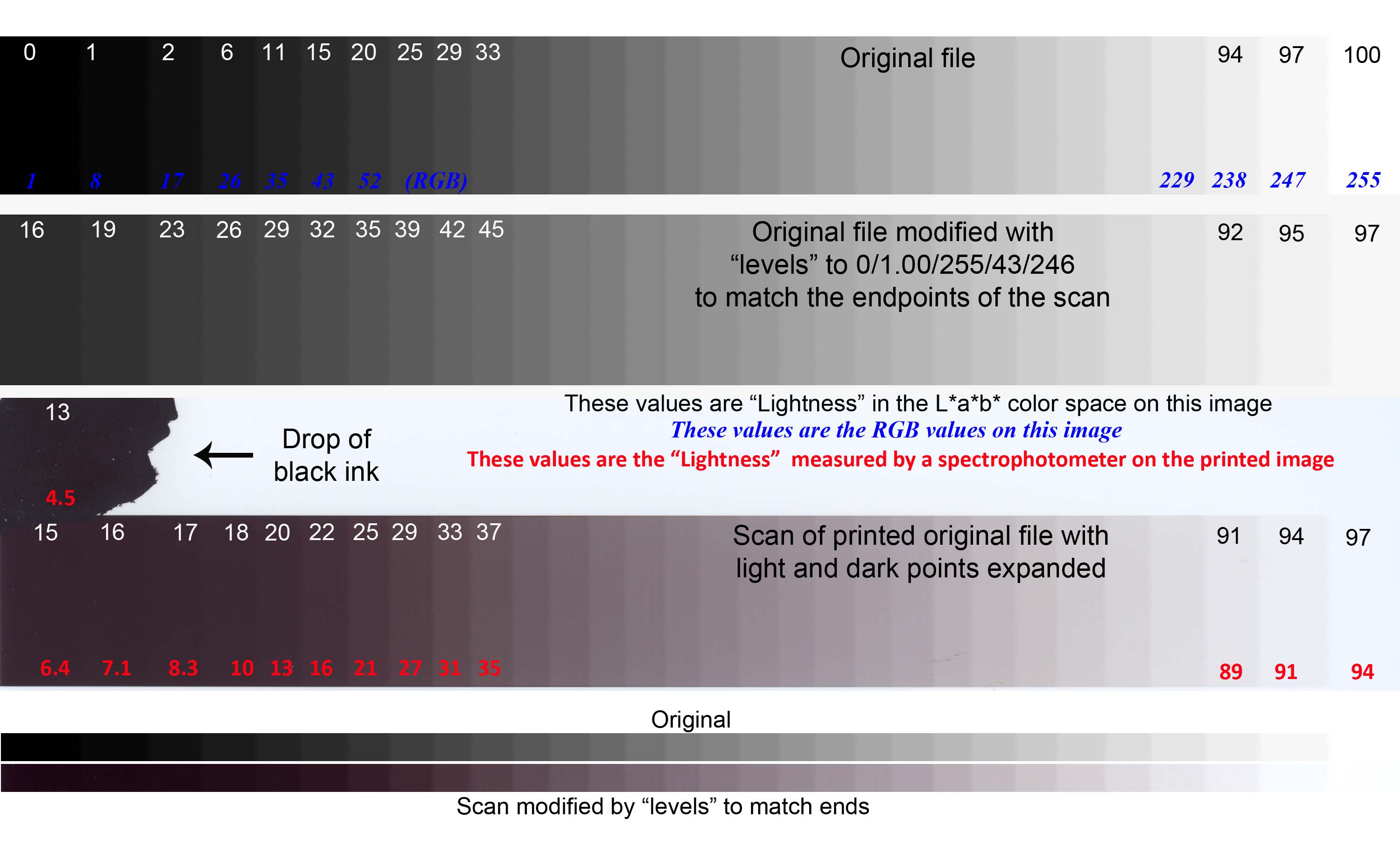
I generated a B&W posterized gradient, printed it and left let it dry overnight by eye, it looks close to the image on the monitor. It was then scanned with the scanner driver settings selected to prevent clipping (a true black will appear as a very dark gray and a true white will appear as a very light gray). The scan data was not processed through any profile it is the raw data from the scanner. The top bar on the following image (in the aRGB color space) is the raw data that was printed (without the notes) using my existing profile for the USA Kirkland paper. The black and white numbers are the Lightness in the L*a*b* color space, and give a good idea of how light each tone appears, while the blue numbers are the R/G/B values (same value for R/G/B to give gray) used to generate each gray tone. Note that the Lightness changes slowly on the darkest tones, even though the R/G/B values change uniformly across the entire gradient.

My monitor is calibrated, and I can easily distinguish between the 97 and 100 values on the right. The darker tones are more difficult to see, but I can still see the difference between 2 and 6. The difference between 1 and 2 can be seen, but only by blowing that area up and scrolling the image back and forth (left and right) the difference is very subtle. I cant visually distinguish between 0 and 1 on my monitor. In any case, this shows that differences between the darker tones are much harder to distinguish than the same differences between lighter tones. If your monitor isnt calibrated, dont be surprised if you cant see the differences at the ends.

The third bar is the scanned data, with a black blob at the top left, where I placed a drop of black ink for 10 seconds, then blotted the excess to get the darkest possible black with this ink and paper. As mentioned previously, the scanners driver was adjusted to prevent clipping, so the darkest and lightest blocks had L values of 15 and 97, respectively. There is s color cast to the scan data that is not present on the print, but this is raw scanner data that has not been run through a profile. The middle bar is a copy of the original data, adjusted to give the same end values as the scanned data to serve as a comparison. On this comparison, the printed data certainly appears to be darker on the left than the original data. As a second check, I used a spectrophotometer to measure the values of several of the blocks, and these values are given in red. This shows that a blob of this ink can only generate an L down to 4.5, and the printer can only get down to 6.4 (because it cant lay down that much ink). Ill leave it to others to convert this to a D-Max. On the right side the paper isnt perfectly white, and only achieves an L of 94%.

Finally, the two thin bars at the bottom are a comparison of the original and scanned data, after the scanned data was adjusted to give about the same visual appearance as the original. Once this was done, the scanned data appears to be much closer to the original. Ill leave it to others to argue which comparison is valid, but the bottom comparison looks close to what I see when comparing the images on the monitor and on the printed page. It can be argued that there is still some compression in the shadows, but I dont find it to be objectionable on my prints or on this test.

Gradient1.jpg


mikling said:
Hey Grandad35, do everything in B&W! Then you'll be a real grandad! and the colors won't matter!
The problem with using a printer without pigment gray&black inks is that the various colors used to make up the gray tones dont fade at the same rate, and even if you initially hit neutral gray the print will develop a color cast when fading occurs. When I want B&W, I print at Costco on their chemical process.

Ill try to get to the profile comparison later today the targets were printed last night and are drying.
 

Grandad35

Printer Master
Platinum Printer Member
Joined
Feb 24, 2005
Messages
1,669
Reaction score
182
Points
223
Location
North of Boston, USA
Printer Model
Canon i9900 (plus 5 spares)
I generated a profile on the Kirkland-Mexico paper using my i9900 and Formulabs inks to compare against my old profile for Kirkland-US paper printed with the same printer and inks (last updated about a year ago). To see the changes between the two profiles. Two copies of the color test image on the left (in the aRGB color space) were converted to each printer profile (to get the color values that would be sent to the printer), the result of the Mexican paper placed on a layer above the US paper and converted to Difference blending mode, the two layers flattened and the result inverted. This result was added to the right of the original image for comparison and is shown below. Note that a white area indicates no change in the values that are sent to the printer and an area with color indicates that that color has changed between the two profiles, with the intensity of the color indicating the magnitude of the difference.

As you can see, the two profiles are fairly close in most areas, and the dark black areas are very similar.

Kirkland_Changes.jpg


As a reference point, the same procedure was followed to compare the Kirkland-Mexico profile with the Canon Photo Paper Pro/OEM ink profile. There is obviously a much larger difference between these two profiles than between the two Kirkland profiles.

Conon_Comp.jpg


Hope that this helps.
 

mikling

Printer VIP
Platinum Printer Member
Joined
Jul 2, 2006
Messages
3,239
Reaction score
1,471
Points
313
Location
Toronto, Canada
While I see that the end result is indeed close, I also wonder whether the process is showing more of a difference in profile ( you sated that yes). Would the test have been more valid if the raw values from the printer was used somehow and not the resultant profile. I am thinking this because some of the differences might been a result of the proprietary algorithms that is used in generating the profile. I say this because lately I have been using the profile edit feature within Spyder3print to tweak the generated profile so that I can gain greater accuracy in a certain range but inevitably it sacrifices something somewhere else. I prefer this because I can make multiple profiles to optimize the output depending on the content from only one set of measurements. This makes that edit feature extremely powerful and allows extracting the maximum performance of the printer in each situation. This is something I recently stumbled upon and did not initially realize the potential of this feature.

Thus depending on what the algorithm that generates the profile uses as a set of weights in its decision, it will influence the end profile.

My further tests also indicates that it is indeed very close on Canon printers however, on Epsons, the differences are slightly greater but not significant enough that most would see. In any case, I have no more of the USA version and am tuning all my previous profiles to favor flesh tones.

Thanks for the effort. Much appreciated.
 

Grandad35

Printer Master
Platinum Printer Member
Joined
Feb 24, 2005
Messages
1,669
Reaction score
182
Points
223
Location
North of Boston, USA
Printer Model
Canon i9900 (plus 5 spares)
mikling said:
Would the test have been more valid if the raw values from the printer was used somehow and not the resultant profile.
That would have also been a good test, but (like you) I don't have any more of the old paper. It would be easy to print the profiling targets on both papers and to scan them with the same (all corrections turned off) scanner settings. Unfortunately, I don't save old targets or the resultant data files from the spectrophotometer.

The difference plot is a "one stage removed" difference in the profile, since it is a difference in the output of the two profiles given the same input image.
 

jjbruja

Getting Fingers Dirty
Joined
Mar 12, 2010
Messages
13
Reaction score
0
Points
26
Location
Palm Beach County, Florida
Printer Model
Epson R300, Photo 1400, 730
For what it's worth, I've been using the Kirkland paper since it was made in the states. I use an Epson R300 photo printer and was getting inconsistent results with different software packages. Nikon Capture NX2, Adobe Lightroom, Elements 7 & 8 and Corel Pro X2. My solution was to use this Kodak profile: KProIJPaper_EpSPR300_v2.icm in all instances. The Kirkland is as good if not slightly better than the Kodak premium and Ultima papers that I also use.
 

qwertydude

Printing Ninja
Joined
May 7, 2009
Messages
522
Reaction score
4
Points
89
I do find the color rendition is slightly better with the Kirkland paper than Kodak's ultra premium high gloss which is their best glossy. When I run the test image of profile prism the program tells me the dynamic range and lab space coverage are slightly better than Kodak's paper, in fact it is even better than canon's photo paper plus glossy. Though it may be that it's because I'm using Stratitec refill ink. I will be switching soon to MIS ink though as I'm on my last bottles of Stratitec.
 
Top