Capture One, Argyll, CM Photo...and display vs. print

ppmax

Newbie to Printing
Joined
Dec 21, 2015
Messages
8
Reaction score
4
Points
9
Printer Model
Canon Pixma Pro-100
Hello--new forum member here...go easy on me please :)

I recently profiled my display and printer using Argyll. In the past I used other tools and am familiar with color management.

To profile my printer I followed a tutorial located here:
http://www.ludd.ltu.se/~torger/photography/argyll-print.html

I profiled using 420 patches and scanned them with the CM Photo spectro. I also profiled my monitor with Argyll, and am generally very happy with my results. For example, I printed the PrinterEvaluationImage from Digital Outback (http://www.jirvana.com/printer_tests/PrinterEvaluationImage_V002.zip) and viewed it under a "daylight" LED 5000K bulb (I can't afford a booth) and under "real" daylight conditions. My display matches my print very well.

I also calibrated/profiled my screen using Argyll; I targeted 6500 with a gamma of 2.3 (measured via the CM Photo spectro).

However, the other day I printed a picture of a person and notice a distinct yellow/amber cast in the printed image. This threw me for a bit of a loop, since my test prints were spot on.

Investigating further, I used Little CMS's tifficc command to generate a soft-proof from my original image. This command (shown below) involves pushing the image through the ICC print profile, then through the ICC display profile. To my surprise, the soft-proof matched my printed output exactly.

What I can't understand is, when soft-proofing in applications like Capture One 9 or Aperture, why the "on screen" soft-proof does not match the soft-proof image created by tifficc...and why the soft-proof looks great while the printed output looks yellow/amber?

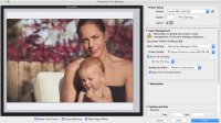
I have attached two images. Please click on them to see the "real" colors since the thumbnail of the original is pretty strange looking.
The first image is the "original" tiff, which has been exported as a JPG. This closely resembles what I see on screen in Capture One 9.
The second image is the soft-proof generated by tifficc also exported as JPG. This image closely resembles what I see in the print.

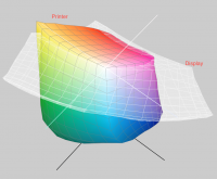
In my years of mostly successful printing images that match what I see on screen, I've never seen a result like this and I can't figure out what's going on. The only "change" is that I've used Argyll recently, rather than other calibration/profiling tools. I'm happy to post the commands I used to generate targets, or generate the soft proof...and I can post a screenshot showing the printer profile gamut vs. the monitor gamut.

Any suggestions, tips, or other info would be appreciated.

Thanks again
PP
 

Attachments

  • original.jpg
    original.jpg
    158.9 KB · Views: 492
  • proof.jpg
    proof.jpg
    1.1 MB · Views: 507

Emulator

Printer Master
Platinum Printer Member
Joined
Jan 4, 2012
Messages
1,675
Reaction score
1,308
Points
277
Location
UK
Printer Model
Canon Pro9000 II
@ppmax , welcome to PrinterKnowledge.

I would be inclined to repeat the sequences of your processing, but using the PrinterEvaluationImage.tif, so that you (and we) may be able to determine the stage in which the unexpected changes are occurring, by visual inspection.
 

ppmax

Newbie to Printing
Joined
Dec 21, 2015
Messages
8
Reaction score
4
Points
9
Printer Model
Canon Pixma Pro-100
Thank you for your reply Emulator--much appreciated. I have read many of your posts ;)

I went back to the man pages for tifficc and now realize that the command I executed on the proof.jpg image used the Absolute rendering intent, which produced a yellow cast in the output. I re-ran tifficc with the colorimetric intent (-m1, rather than -m3) and now the soft proof looks "normal," and matches what I see in Capture One. Use of the Absolute intent is to simulate paper white...so this makes sense.

Now, what I can't figure out is why my screen and print don't match more closely. It's almost as if my print was made using the Absolute rendering intent, rather than Relative Colorimetric.

I would be inclined to repeat the sequences of your processing, but using the PrinterEvaluationImage.tif, so that you (and we) may be able to determine the stage in which the unexpected changes are occurring, by visual inspection.

I just re-printed the image from Capture One using my custom printer profile, relative colorimetric intent, and black point compensation. Color management in the print driver is off since it is being controlled by the custom print profile generated from Argyll. Everything looks good, grays are neutral...except for a little preponderance of yellow/amber in the color of the right-most baby's face...which is similar to the yellow/amber cast in the proof.jpg I posted previously. So, it would seem that these particular flesh tones are getting exaggerated in the print, or "under represented" on screen.

I am also including a screenshot from Apple's ColorSync Utility showing the display and printer gamuts. As you can see the printer gamut contains more yellows than the display gamut (my 27" iMac). This would seem to indicate that the screen isn't able to display the true flesh tones in my image because they may be out of the display gamut. However, I exported a TIFF from Capture One and then did a soft-proof gamut check in Photoshop and none of the flesh tones in the image are out of gamut. I have posted a screenshot of this as well.

Puzzled...and thanks again for your help and interest.

PP
 

Attachments

  • profiles.png
    profiles.png
    1.1 MB · Views: 513
  • gamutCheck.png
    gamutCheck.png
    728.6 KB · Views: 516

Emulator

Printer Master
Platinum Printer Member
Joined
Jan 4, 2012
Messages
1,675
Reaction score
1,308
Points
277
Location
UK
Printer Model
Canon Pro9000 II
I suspect you are experiencing the "too many variables" syndrome. I would stick to colorimetric intent and use a test image such as the PrinterEvaluationImage, where it is possible to recognise variations at any stage.

I am not familiar with Apple computers and they may suffer from their own issues.

As you have Argyll installed, I suggest you try profiling your monitor using dispcalGUI and the Colormunki. You will find it gives you an excellent insight into the performance of your monitor.

If you wish I can display your generated ICC profile in Gamutvision. Or you can take advantage of the free trial period with a downloaded version of Gamutvision, although it takes time to familiarise.

If you make a copy file of your ICC profile and rename the file from xxxxxx.icc to xxxxxx.txt you can upload the .txt file into a post on this site and allow others to examine it.

Goodluck
 

Ink stained Fingers

Printer VIP
Platinum Printer Member
Joined
Dec 27, 2014
Messages
5,860
Reaction score
6,984
Points
363
Location
Germany
Printer Model
L805, WF2010, ET8550
I'm not working in the Mac environment, so let me just make some more general comments and raise some questions.
screen isn't able to display the true flesh tones in my image
- you are talking about 'true flesh tones' - where to you get those from - not from a jpg image with an arbitrary white balance setting by the camera, so that skin tone is already tuned in a particular direction before you even start viewing or printing the image. The perception of skin tones by the eye and your vision system is particularly tricky, it is biased by some general preferences and your personal memory - only you remember the deails, the emotions, the athmospheric situation whether you took that image at noon or at sunset. And as a general preference we prefer skin tones to be more saturated in the orange range than they actually are, we consider that as a kind of a healthy look.
You are displaying the printer and display gamut, the differ very much, the printer yellow is a little bit more saturated - o.k., but your skin tones are not directly in that yellow corner. I'm wondering more that the display gamut is missing the bottom part altogether and would not correctly display darker colors at all. Such a display gamut would make proofing impossible. I typically print with rel. col. or perceptual rendering intent. I don't think that the abs.col. intent would do any good, since you are not working in a calibrated/profiled environment from beginning to end, e.g. with flash lights, a camera profile , and/or predefined colors like those from the Pantone color set you need to keep correct in the printout.
You are profiling your monitor for 6500K, but view the prints under a 5000K lamp, or at daylight - whatever light - sun or overcast or --- with an unkown color temp - all that does not make it easier.
 

RogerB

Print Addict
Joined
Sep 27, 2010
Messages
293
Reaction score
315
Points
183
Location
S.E. England
Printer Model
Epson Pro3880
I'm not at all sure what's going on, but like ISF I'm pretty sure that the skin tones are well within the monitor gamut. Getting the print to match the screen is always tricky and you may need to try different screen calibration points. For example, I find I get the best match when I set my wide-gamut screen to 5800K - and I view with 4700K Solux lamps. Your viewng light may also be affecting things. Do the prints look the same in daylight as they do under your 5000K LED? Normal LED lamps are well known for producing yellow casts in skin tones because they are deficient in red.

I think the best way to start to get a handle on this is to go the pure objective route to test your profile, if only for the skin tone in question. It's very easy to print a square of the problem tone and then to measure it with your ColorMunki. To do this you would need to print using Absolute rendering especially if your paper has OBAs. Then again, if you want to be really rigourous you can print a multi-patch target, measure it and determine the accuracy for a whole range of colours.

And, of course, you can take up Emulator's suggestion and make your profiles (monitor and printer) available for forum users to analyse. Only takes a couple of minutes to do with Gamutvision and it may show up any anomalies.
 

RogerB

Print Addict
Joined
Sep 27, 2010
Messages
293
Reaction score
315
Points
183
Location
S.E. England
Printer Model
Epson Pro3880
Just for interest (things are a bit quiet in the run-up to Christmas!) I downloaed your original and looked at the range of colours relative to my monitor profile. Below is how it looks. The dots represent the individual colours in your image and you can see that they are nowhere near the gamut boundaries of my monitor. I suspect your monitor is not so different.

Ashampoo_Snap_2015.12.22_15h18m45s_001_Gamutvision 1-3-7  .png
 

Ink stained Fingers

Printer VIP
Platinum Printer Member
Joined
Dec 27, 2014
Messages
5,860
Reaction score
6,984
Points
363
Location
Germany
Printer Model
L805, WF2010, ET8550
I'm not using Color Munki, but it is my understanding that it offers a profile optimization option for images you want to print. You may use the image with the particular skin tones in question , or a crop of that image, as a target for that profile improvement cycle. It will create some more target points in the color area of concern and possibly improve the profile - or not.
Thanks RogerB, I was just going to do the same with that image - you were faster..and I forgot
to mention that I have my monitors adjusted to 5700K
 
Last edited:

ppmax

Newbie to Printing
Joined
Dec 21, 2015
Messages
8
Reaction score
4
Points
9
Printer Model
Canon Pixma Pro-100
Wow--thank you sincerely for all the replies and suggestions. I appreciate all your feedback and help.

For clarity, here is a summary of what I have done:
  1. I'm printing on a Pro-100 with Precision Color replacement inks. Print head has been cleaned and aligned recently.
  2. I am printing on Epson Premium Luster paper (I bought a ton of this stuff when I had the Epson 2200!)
  3. Calibrated/profiled my monitor with Argyll. I picked a target of 6500 and gamma of 2.3 (which was measured by the ColorMunki).
  4. Profiled my printer with Argyll using 420 patches. I opted for the "pre-conditioning" option and referenced the Canon Pro-100 Photo Paper Pro Luster ICC profile during generation of the custom profile.
  5. Soft proofed the PrinterEvaluationImage.tif file in Capture One 9 using a custom process recipe that references my custom printer profile.
  6. Printed the PrinterEvaluationImage.tif using my custom profile plus RelCol intent + black point compensation. I have printed this document several times and am getting consistent results.
  7. Compared the print to my screen under a 5000K LED and under "real" daylight and the print and screen match very well. I am very pleased when comparing the print and screen.
  8. Printed another image (referenced above) using the same process and profiles...and the flesh tones look very amber/tan vs. my screen. This was unexpected because the PrinterEvaluationImage.tif print matches my screen very closely.
Essentially, my question is:
Is there something about this particular image (perhaps the range of flesh tones) that isn't handled well by my profiles? In other words, if all my test prints of the PrinterEvaluationImage.tif are "spot on" vs. my screen, why is this particular image not?

>>Your viewng light may also be affecting things. Do the prints look the same in daylight as they do under your 5000K LED? Normal LED lamps are well known for producing yellow casts in skin tones because they are deficient in red.

This may be the reason...although prints of the PrinterEvaluationImage.tif look good under my lamps. Hopefully we'll get some clear skies today so I can view the prints under some nice "real" daylight to see if the LED lamp is causing this...

>>I'm not using Color Munki, but it is my understanding that it offers a profile optimization option for images you want to print. You may use the image with the particular skin tones in question , or a crop of that image, as a target for that profile improvement cycle. It will create some more target points in the color area of concern and possibly improve the profile - or not.

I am familiar with this functionality with the Colormunki software. Does Argyll offer something similar, so that an existing profile can be "refined" by scanning additional images/patches?


Thanks again for all the responses and suggestions...I'll report back after returning home from work later today.

PP
 

ppmax

Newbie to Printing
Joined
Dec 21, 2015
Messages
8
Reaction score
4
Points
9
Printer Model
Canon Pixma Pro-100
Just for interest (things are a bit quiet in the run-up to Christmas!) I downloaed your original and looked at the range of colours relative to my monitor profile. Below is how it looks. The dots represent the individual colours in your image and you can see that they are nowhere near the gamut boundaries of my monitor. I suspect your monitor is not so different.

View attachment 3709

Thank you for doing this...it is great to see that all the tones within the image fit within your display profile. I suspected this, and have done a gamut check on the image, but your plot shows this conclusively. Thanks again!

PP
 
Top